31 Color Combo Room Ideas That Transform Any Space
Picking the right color combo for room ideas is harder than it looks. You love a color on Pinterest, paint your wall, and suddenly the whole room feels off. The undertones clash, the mood is wrong, or the space looks smaller than before. It happens to almost everyone. The good news is that color pairing follows patterns you can learn. Once you understand which combinations work and why, decorating gets a lot easier. These 31 ideas give you a real starting point — no design degree needed.
Color sets the entire tone of a room before you buy a single piece of furniture. A wrong combination can make a cozy bedroom feel cold or a bright living room feel chaotic. But the right pairing can make even a small apartment feel pulled together and intentional. That is the power of working with color combinations, not against them.
This guide covers color combos for every style from soft and neutral to bold and dramatic. Each idea is paired with a practical image prompt so you can visualize it before committing to paint. Whether you are redecorating one room or planning a full home refresh, there is something here for every space and budget.
1. Sage Green and Warm White
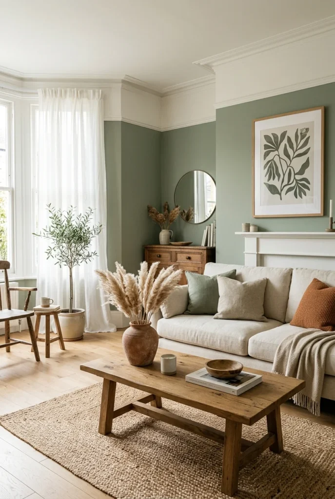
Sage green is one of the most popular wall colors right now, and it works because it sits right between warm and cool tones. Paired with warm white think cream or off-white rather than stark white it creates a room that feels calm without being boring. This combo works especially well in living rooms and bedrooms where you want a relaxed, nature-inspired feel.
The key to making this combination land is choosing the right white. Bright, cool whites can make sage green look washed out or even slightly gray in dim lighting. A warm white, like Benjamin Moore White Dove or Sherwin-Williams Alabaster, brings out the green’s earthy undertones. Add wood accents and linen textures to complete the look.
This pairing is incredibly versatile. You can dress it up with gold hardware and velvet throw pillows, or keep it laid-back with rattan furniture and cotton textiles. It photographs beautifully, which is probably why it dominates Pinterest home boards. If you want a timeless, Pinterest-worthy room that does not feel trendy or dated, this is where to start.
2. Navy Blue and Burnt Orange
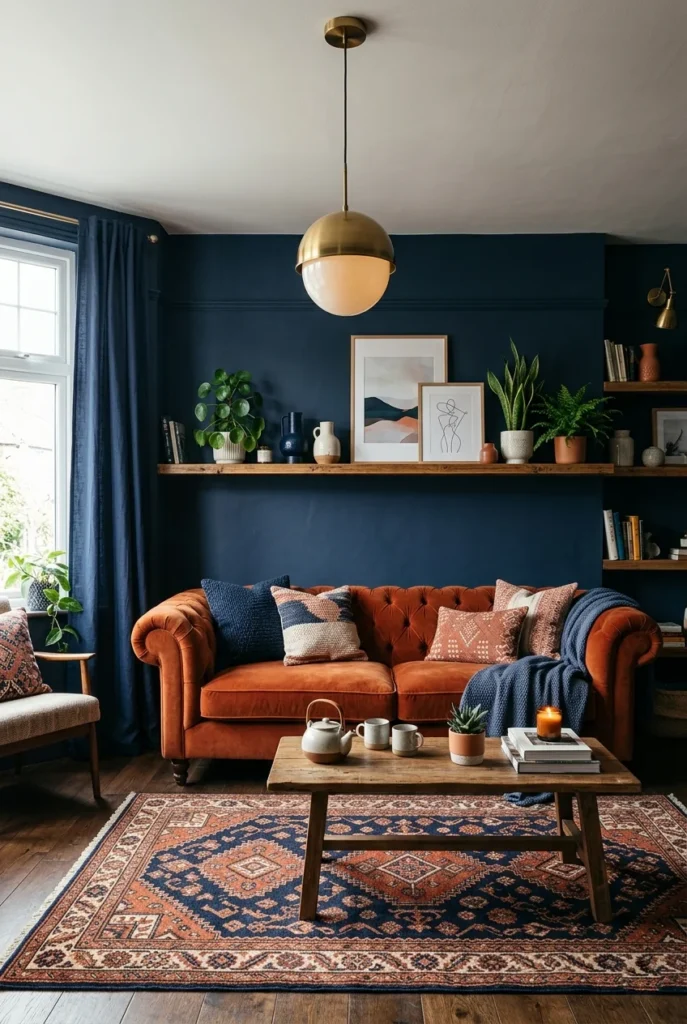
Navy and burnt orange is a color combo that looks like it shouldn’t work and then it completely does. These two sit across from each other on the color wheel, which makes them complementary colors. Complementary pairs always create high contrast and visual energy, but the deep richness of navy keeps the orange from feeling overwhelming. The result is a space that feels bold and intentional, not chaotic.
This combination works best in living rooms, home offices, or dining rooms where you want the space to make a statement. Use navy as the dominant color on walls or a large sofa, then introduce burnt orange through accent chairs, throw pillows, or artwork. Too much orange can tip the balance, so treat it as a supporting player rather than the star.
Brass and dark wood are the best metals and materials to pair with this combo. They bridge the warm and cool tones without pulling the room in either direction. A Persian or Moroccan-style rug in this color palette can anchor the whole space and make the combination feel curated rather than accidental.
3. Dusty Pink and Charcoal Gray

Dusty pink and charcoal gray are the combination for people who think they do not like pink. The dusty, muted pink has almost no sweetness it reads more as a neutral with a warm undertone. Paired with the cool depth of charcoal, it creates a sophisticated, grown-up color story that feels balanced and modern.
This pairing is especially strong in bedrooms. Charcoal on an accent wall or on a dark bed frame grounds the pink’s softness without making the room feel heavy. The contrast between the two keeps the space from looking flat, which is a common issue when you decorate with too many soft tones in the same value range.
Layer in textures to make this combination feel luxurious. A velvet dusty pink duvet, linen pillowcases, and a chunky wool throw all work beautifully here. For accessories, matte-black hardware and brushed-nickel or pewter fixtures complement both colors without competing for attention.
4. Terracotta and Cream

Terracotta is the color of sun-baked clay, and it brings warmth into a room in a way that few other colors can. Paired with cream a soft, slightly warm white the combination feels earthy, grounded, and welcoming. It is the kind of color palette that makes you want to sit down and stay a while.
This combo works exceptionally well in dining rooms and kitchens because it evokes food, nature, and warmth. Terracotta walls paired with cream furniture create a layered look without requiring many accessories or artwork. The colors do most of the heavy lifting on their own. You can also flip it cream walls with terracotta ceramics, cushions, and textiles work just as well in a brighter space.
Natural materials are the best companions for this palette. Wicker, rattan, raw wood, jute rugs, and linen all reinforce the earthy theme. Avoid anything too shiny or modern in this space, as it can break the cohesive warmth of the combination. Plants also thrive in terracotta and cream rooms the greenery adds a natural accent without disrupting the palette.
5. Forest Green and Gold

Forest green and gold is one of those classic combinations that never feels dated. The depth of a dark, rich green gives gold something to shine against, and gold in turn adds warmth and light to a color that could otherwise feel heavy or cave-like. Together, they suggest luxury without being flashy.
This is a strong choice for home offices, libraries, or living rooms where you want the space to feel serious and elegant. Dark green walls are not for everyone, but if you commit, the results are dramatic in the best possible way. Start with a single accent wall if you are hesitant, and let the gold accents do the rest a gilded mirror, brass light fixtures, or gold picture frames are enough to activate the combination.
Pair this duo with dark walnut furniture and jewel-toned velvet or deep leather for a maximalist take. For a cleaner look, stick to simple furniture in natural oak or cream and let the color do the talking. Either approach works the green and gold carry the room regardless.
6. Soft Lavender and White

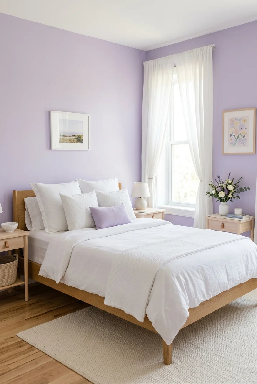
Lavender has a reputation for being a child’s room color, but soft lavender paired with clean white is anything but juvenile. When the lavender is muted and slightly grayed rather than a bright purple it reads as a sophisticated, restful neutral. White keeps it from feeling heavy, and together they create a room that feels like a breath of fresh air.
Bedrooms and bathrooms are the best places for this combination. The calming effect of lavender on the nervous system is well-documented, making it a smart choice for spaces dedicated to rest and relaxation. White fixtures, trim, and bedding amplify the light and prevent the lavender from darkening the room.
Add silver or chrome hardware to complement the cool tones in both colors. Fresh flowers — especially white or pale purple varieties like lavender, wisteria, or white ranunculus — look stunning in this space and bring the palette to life. Keep the overall look clean and uncluttered; this combination breathes best in a minimal space.
7. Black and Warm Beige
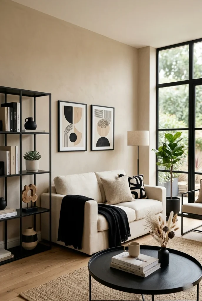
Black and beige sounds basic until you see it done well. The contrast is high enough to feel intentional and modern, but the warmth of beige prevents the space from feeling stark or cold. This combination is the neutral palette for people who find gray too flat but still want something that works with almost everything.
The ratio matters a lot here. Too much black and the room feels heavy; too little and the contrast disappears. A good rule of thumb is 70-80% beige with 20-30% black. This could mean black window frames or shelving against beige walls, or a black accent piece in a mostly beige room. The beige does the softening; the black does the defining.
This palette adapts easily to different styles. In a Japandi or Scandinavian-inspired space, keep the lines clean and the textures simple. In a more traditional room, add woven textiles and organic shapes to soften the contrast. Natural wood tones bridge both colors beautifully, preventing the combination from looking too stark or corporate.
8. Cobalt Blue and White

Cobalt and white is a combination with deep roots in Mediterranean and coastal design, and it continues to look fresh because the contrast is so clean. Cobalt is vivid without being garish, and white gives it space to breathe. Together, they create rooms that feel energetic and happy in a way that is easy to live with long-term.
Kitchens and bathrooms are natural homes for this pairing, though it works beautifully in dining rooms and entryways too. Cobalt blue tiles, cabinetry, or an accent wall against white walls and fixtures creates that unmistakable sunny, European feel. The key is keeping the white crisp a warm cream can muddy cobalt’s brightness, so go for a clean, bright white here.
Brass or antique gold hardware is the best finishing touch for cobalt and white spaces. It adds warmth and stops the combo from feeling too clinical. Terra-cotta pots, wooden cutting boards, and woven baskets round out the look and give the room an organic feel that keeps it from looking like a showroom.
9. Rust and Dusty Blue

Rust and dusty blue are a pairing that immediately feels bohemian and collected. Both colors are muted and earthy rather than bright and saturated, which means they harmonize easily without competing. Rust brings warmth and grounding; dusty blue adds a cooling calm. The result is a room that feels lived-in and layered in the best way.
This combination is perfect for bedrooms, sunrooms, or any space with a relaxed, personal feel. You do not need to paint entire walls even a dusty blue wall with a rust throw, some terracotta planters, and a patterned rug in both tones creates a cohesive space without requiring a full redesign.
Layer multiple textures for the best effect. A jute rug, a woven throw blanket, linen curtains, and a macramé wall hanging all reinforce the artisanal quality of this palette. Warm wood tones and natural greenery round out the look. This is a great color combo if you enjoy collecting items over time rather than buying a complete matching set.
10. Emerald Green and Blush Pink
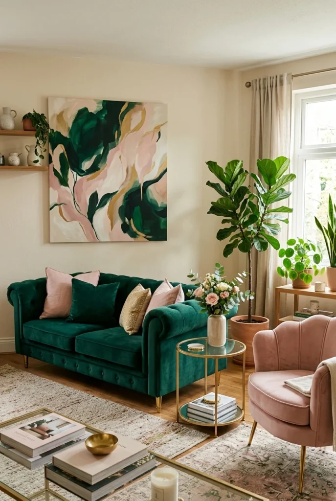
Emerald green and blush pink are a color combo that feels simultaneously bold and romantic. The richness of emerald anchors the softness of blush, preventing the pink from looking sweet or childish. Together, they create a space with real personality the kind of room that stops the scroll on Pinterest.
This pairing works well in living rooms, dining rooms, or even a statement bedroom. Use emerald as the dominant color in a large piece a sofa, curtains, or an accent wall — and bring in blush as a secondary tone through cushions, an accent chair, or artwork. Keeping the balance weighted toward the green ensures the overall mood stays sophisticated rather than feminine.
Gold accessories are the natural third element for this combination. A brass lamp, gilded mirror, or gold picture frames tie the warm and cool tones together while adding a layer of elegance. Keep the background walls neutral a warm white or soft greige so the emerald and blush can take center stage without the space feeling overloaded.
11. Warm Gray and Mustard Yellow
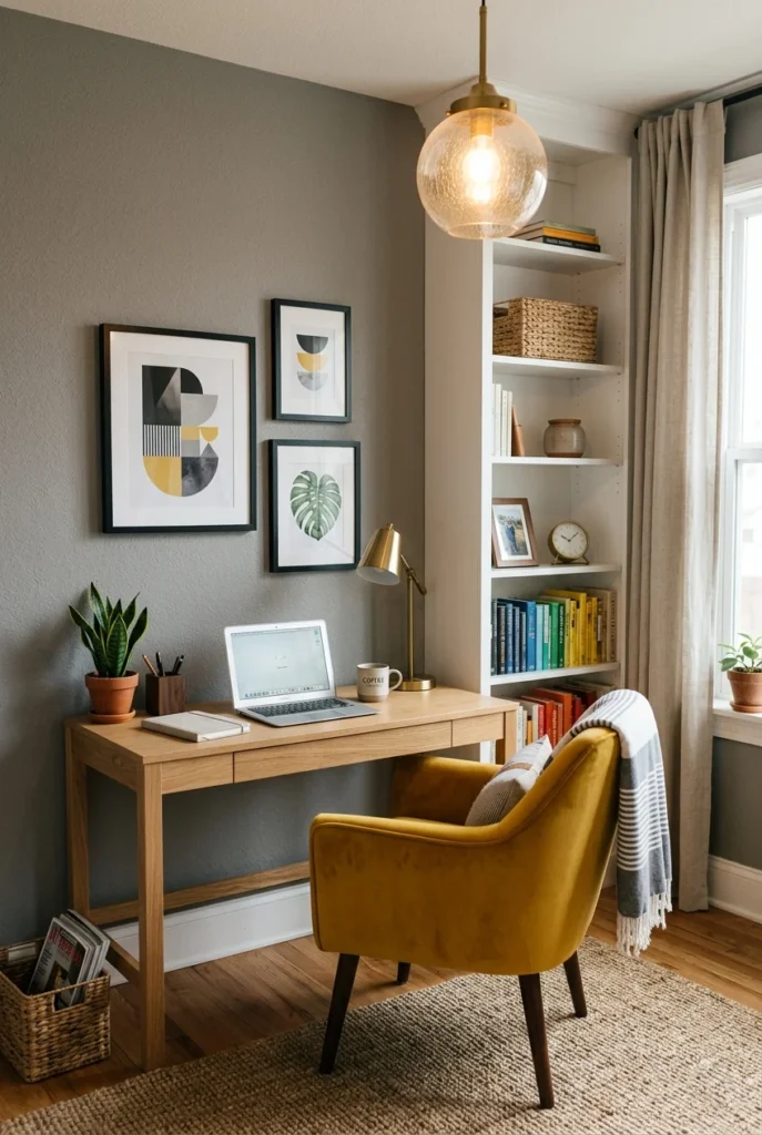
Warm gray is the update that cool gray needed. Where cool gray can feel flat and lifeless, warm gray has underlying beige or yellow tones that give it life and make it easier to decorate around. Paired with mustard yellow a rich, deep version of yellow with golden undertones the result is a combination that feels warm, cheerful, and grounded all at once.
This combo is particularly well-suited to home offices, living rooms, and kitchens. Mustard yellow is bold enough to energize a workspace without being so bright as to be distracting. In a living room, it adds warmth and character. In a kitchen, mustard-yellow cabinetry or bar stools against warm gray walls create a retro-modern look that is hard to resist.
Mid-century modern furniture works beautifully in this palette think tapered wood legs, curved silhouettes, and walnut finishes. Brass or matte gold hardware reinforces the warmth. This color combination photographs extremely well in natural light, making it one of the most-pinned home palettes for good reason.
12. Midnight Blue and Copper

Midnight blue is so deep it is almost black, and that depth is exactly what makes it work so well with copper. Copper is warm and reflective, and against a dark blue background, it literally glows. This combination feels dramatic and intentional the kind of bedroom design that looks like it belongs in a boutique hotel.
The key to using midnight blue without making a room feel oppressive is lighting. Wall sconces, table lamps, and warm-toned bulbs prevent the dark walls from absorbing too much light. Mirrors also help a copper-framed mirror bounces light around the room while reinforcing the color palette.
Use white or cream bedding to break up the darkness and keep the space from feeling too heavy. The contrast between midnight blue walls, white bedding, and warm copper accents creates a beautiful three-way balance. If you want to go all-in on the moody look, swap the white bedding for deep teal or forest green for a jewel-toned take on this already dramatic combination.
13. Olive Green and Camel

Olive green and camel are a combination built entirely from nature. These are the colors of grasslands, deserts, and dried botanicals an earthy, organic palette that brings the outside in. Both colors are warm and muted, which means they harmonize effortlessly without any color-theory knowledge required.
This is an excellent palette for living rooms, reading nooks, or any space you want to feel cozy and grounded. Olive and camel work across multiple styles they feel at home in a modern desert-inspired space, a bohemian room, a mid-century interior, or even a traditional farmhouse setting. That versatility is what makes it so popular on home decor boards.
Leather, suede, and woven textures are natural companions for this palette. A camel leather sofa or chair with an olive green wool throw, a jute rug, and a few dried botanical arrangements creates an effortlessly composed look. Add some simple wooden furniture with visible grain to reinforce the natural theme without overcomplicating the space.
14. Pale Yellow and Sky Blue
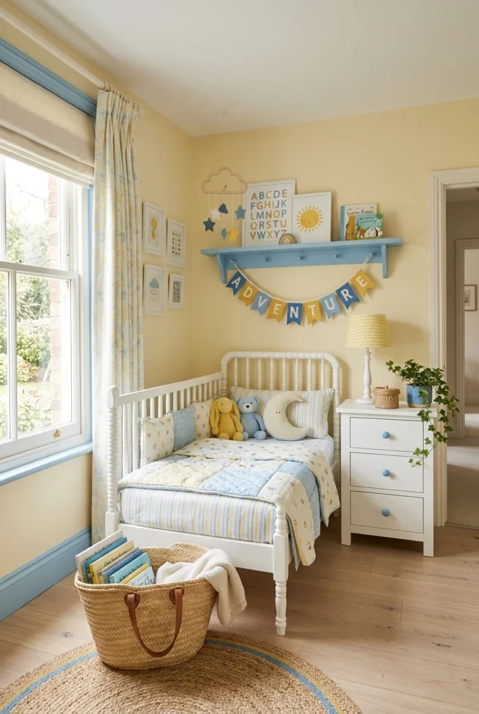
Pale yellow and sky blue are a combination that feels genuinely happy not in a theme-park way, but in a warm, optimistic, sunrise-over-the-ocean way. These are the colors of clear summer mornings, and they bring that same lightness into any room they are used in. Both colors are soft and light, so the combination feels fresh and airy without being overwhelming.
This palette works particularly well in nurseries, children’s rooms, and breakfast nooks where you want to start the day with some visual energy. In a kitchen or dining area, pale yellow walls with sky blue accents on chairs, cushions, or window trim create a cheerful space that makes meals feel like an occasion.
Keep the saturation of both colors low for the most sophisticated result. Pale, slightly desaturated versions of both yellow and blue prevent the combination from looking cartoonish. White furniture and natural wood accessories complete the look. Add a simple gingham or stripe pattern in both colors to tie the textiles together without overcomplicating the design.
15. Chocolate Brown and Ivory
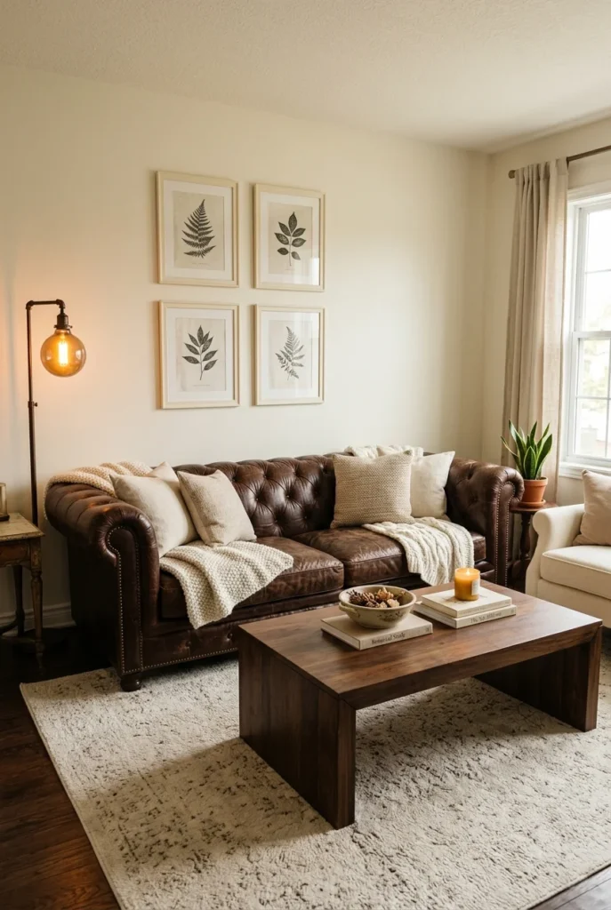
Chocolate brown and ivory are a classic combination that predates interior design trends — and that is exactly its strength. These two colors have been paired together for centuries in architecture, furniture, and textiles because they always look intentional and refined. The deep warmth of chocolate grounds the softness of ivory, creating a balanced, luxurious palette.
This combination is ideal for living rooms and studies where you want a space that feels established and comfortable. A chocolate brown leather sofa against ivory walls reads as traditional and elegant. In a more contemporary space, chocolate velvet cushions against ivory upholstered furniture keep the combination intact while lightening the mood.
Layer different shades of both colors for depth. A lighter tan leather with a dark walnut table and ivory walls creates tonal variation, preventing the room from looking flat. Antique brass or aged gold accessories work beautifully here, adding a warm metallic note that ties the whole palette together. This combination ages gracefully — it will look just as good in 10 years as it does today.
16. Teal and Warm White
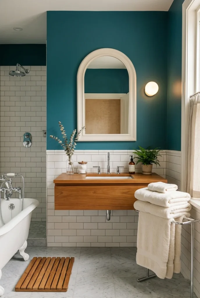
Teal is one of those rare colors that works in almost every room of the house, and its best partner is warm white. Teal sits at the intersection of blue and green, giving it a versatility that neither pure blue nor pure green has. Against warm white, it feels both fresh and cozy — a hard balance to achieve with a single color choice.
Bathrooms are a natural home for teal and white. Teal walls with white subway tiles, fixtures, and towels create a spa-like atmosphere that feels both clean and inviting. In a kitchen, teal lower cabinets paired with warm white upper cabinets and countertops create a bold yet livable color-blocked look.
The warmth of the white matters here. A stark, bright white can make teal feel cold and clinical. A warm white with slightly yellow or cream undertones keeps the palette feeling welcoming. Natural wood accents a bamboo bath mat, teak shelving, or a rattan basket add organic warmth, preventing the combination from looking too polished or sterile.
17. Blush Pink and Gold

Blush pink and gold is the combination that defined a Pinterest era — and it has earned its place because it genuinely works. Blush is romantic and soft without being saccharine, and gold adds warmth, richness, and a touch of glamour. Together, they create spaces that feel indulgent and carefully designed.
This pairing is strongest in bedrooms, dressing rooms, and bathrooms where a sense of luxury and personal comfort is the goal. Blush-pink walls or bedding paired with gold hardware, mirrors, and light fixtures create an instantly elevated look. Even a small amount of gold a frame here, a lamp there transforms blush from sweet to sophisticated.
To prevent this combination from veering into overly feminine territory, balance the softness with more structured furniture shapes and a neutral floor. A simple white or ivory rug, clean-lined furniture in white or natural linen, and minimal clutter let the blush and gold shine without overdoing it. Marble accessories add texture and reinforce the luxe quality of the palette.
18. Charcoal and Terracotta

Charcoal and terracotta are a pairing that bridges the modern and the ancient. Charcoal is sleek and contemporary; terracotta is primal and earthy. Together they create a tension that makes a room feel collected and interesting like someone who has both a minimalist sensibility and a love of natural materials.
This combination works well in living rooms and dining rooms where you want a grown-up, grounded aesthetic. Use charcoal as the dominant background color walls, a large sofa, or dark furniture and bring in terracotta as an accent through cushions, pottery, or a statement rug. The warmth of terracotta prevents charcoal from feeling cold or corporate.
Raw and tactile materials are the right companions for this palette. Concrete, raw linen, matte ceramic, rough plaster, and aged leather all fit the mood. Avoid anything too shiny or ornate, as it disrupts the earthy, understated quality of the combination. A few live plants in terracotta pots are the perfect finishing touch, naturally pulling the whole palette together.
19. Lavender and Sage Green

Lavender and sage green are a combination pulled directly from a wildflower meadow — and it brings that same organic, gentle beauty into interior spaces. Both colors are soft and slightly grayed, which means they sit comfortably together without clashing. The result is a room that feels like a walk through a herb garden: calming, fresh, and quietly beautiful.
This palette works especially well in bedrooms and bathrooms where the goal is rest and restoration. The muted tones of both lavender and sage ensure that the combination reads as sophisticated rather than whimsical. Keep the saturation low — pale, almost-neutral versions of both colors work better than bright, saturated ones.
Natural textures reinforce the palette’s botanical quality. Linen bedding, cotton curtains, and a simple jute or wool rug all complement the colors without competing with them. Fresh herbs in small white pots, dried flower arrangements, and simple botanical prints make for perfect accessories. This is one of the most soothing color combos for a bedroom, and it is also one of the most Pinterest-popular for good reason.
20. Black and White with a Pop of Red

Black, white, and red are one of the most graphic color combinations in existence, and it works because it follows a simple rule: use black and white as the base, and let red do all the work. The contrast of black and white creates a visual framework that red can punch through with maximum impact. Even a single red object in a black-and-white room commands the entire space.
Kitchens are a natural setting for this combination, particularly in a retro or diner-inspired design. Black-and-white checkerboard floors paired with white cabinetry and red accessories create an instantly recognizable, timeless look. In a living room or home office, a red accent chair in a black-and-white space creates a focal point that anchors the entire room.
The secret to making this combination feel current rather than clichéd is restraint. Too much red makes the room feel aggressive; just enough makes it feel bold and intentional. One or two red elements a pendant light, a pair of chairs, a throw blanket are all you need. The black-and-white structure does the organizing; the red provides the personality.
21. Peach and White

Peach is having a major moment in interior design, and its most accessible pairing is simply white. Peach walls paired with white furniture, trim, and textiles create a warm, cheerful room that feels neither busy nor overwhelming. The combination feels almost edible the interior design equivalent of a warm summer afternoon.
This palette works in almost any room, but it is especially appealing in living rooms, bedrooms, and dining areas. The warmth of peach is flattering in the light of day and feels glowing in the evening with warm artificial lighting. White keeps the palette from feeling overly sweet or dated, making the space feel larger and more open.
Lean into natural materials and minimal clutter for the best results. A peach-and-white room with too many accessories can look busy; a clean, edited version of this palette feels fresh and sophisticated. Dried botanicals in warm earth tones, simple white ceramic vases, and light wood furniture are all you need to complete the look.
22. Slate Blue and Warm Tan

Slate blue and warm tan are one of the most underrated color combinations in home design. Slate blue has a quiet depth to it it is not as dramatic as navy or as cheerful as sky blue, but it has a still, contemplative quality that makes rooms feel settled and refined. Warm tan brings just enough warmth to prevent the blue from feeling cold.
This combination is perfect for bedrooms and home offices spaces where you need to focus or rest without distraction. The colors are harmonious rather than contrasting, resulting in a low visual noise level in the room. Everything feels organized and calm. That is harder to achieve than it sounds, and it is why this pairing keeps showing up in high-end interior design.
Use natural linen and cotton textiles to reinforce the warmth of the tan, and keep the blue in larger surfaces like walls or a statement headboard. A warm-toned wood floor or rug grounds the palette. Matte black or brushed bronze hardware provides contrast without disrupting the overall serenity of the combination.
23. Mauve and Gray

Mauve is a warm-toned pink-purple that is inherently sophisticated. It never reads as girlish or over-the-top, because the gray undertones pull it firmly into neutral territory. Paired with actual gray particularly a warm gray the combination creates a layered, tonal palette that looks intentional without being overdone.
This is a wonderful combination for living rooms, bedrooms, and home offices. Mauve and gray work on the same value level, which means they blend together seamlessly while still creating a subtle tonal contrast. The palette reads as calm and considered from a distance, and reveals more depth the closer you look.
Add texture to prevent this combination from looking flat. A chunky knit throw in mauve, a velvet cushion in deep plum, or a gray wool rug all add dimension without disrupting the tonal harmony. Warm wood accessories and soft lighting keep the palette from feeling too cool or gray-dominant. This is the combination for people who want a grown-up, restful space with a hint of personality.
24. Cream and Dusty Blue

Cream and dusty blue are a combination with a long history in traditional interiors — and it has found a new audience because it looks just as relevant in contemporary spaces. Cream is warmer and richer than white, which means it pairs more forgivingly with the muted coolness of dusty blue. Together, they create a room that feels timeless and gently lived-in.
This combination is particularly beautiful in entryways, hallways, and living rooms where you want a welcoming, classic feel. Dusty blue wainscoting or lower wall panels with cream upper walls and ceiling is a traditional application that still feels fresh. Alternatively, dusty blue curtains against cream walls create a sophisticated layered look without any paint.
Antique or vintage furniture pairs especially well with this palette. The worn warmth of aged wood or painted furniture fits naturally into the cream-and-dusty-blue world. Add brass or antique bronze hardware for a finishing touch. Simple botanical or floral prints in both tones make for perfect wall art that reinforces the quiet elegance of the combination.
25. Burnt Sienna and Off-White
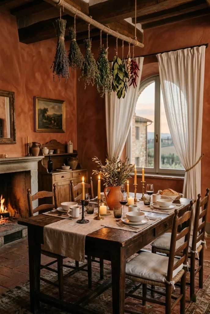
Burnt sienna is the color of old Mediterranean walls deep, warm, and rich with character. Paired with off-white, the combination evokes sun-drenched Italian farmhouses and the slow pace of a life lived around good food and natural beauty. It is a combination of history and soul baked into it.
This palette works beautifully in kitchens and dining rooms where the goal is warmth and conviviality. Burnt sienna walls with off-white trim, linen curtains, and simple wooden furniture create a space that feels genuinely inviting. The color is strong enough to carry the room without many accessories, making it a low-effort yet high-impact choice.
Rustic and artisan elements are the natural companions here. Handmade ceramic dishes, rough-hewn wooden shelves, terracotta pots of herbs, and woven baskets all reinforce the Mediterranean spirit. Keep lighting warm and soft harsh overhead lighting fights against the warmth of this palette. Candlelight or warm Edison bulbs are ideal.
26. Indigo and Brass

Indigo and brass are a combination for people who want their bedroom to feel like a destination rather than just a place to sleep. Indigo the deep blue-purple of natural dye — is rich and immersive, and brass cuts through that depth with warm, reflective light. The contrast between the cool depth of indigo and the warm shimmer of brass creates a room with genuine drama.
This pairing works best in bedrooms or dining rooms where a moody, atmospheric quality is an asset. Indigo walls with brass light fixtures, mirror frames, and hardware create a jewel-box effect that feels both intimate and opulent. The key is using enough brass to bring light into the space indigo can absorb a lot of light, and the reflective quality of brass compensates beautifully.
White or cream bedding and linens lighten the mood and prevent the dark walls from feeling oppressive. A simple ivory or cream rug softens the floor. Plants in brass or ceramic pots add a living element that grounds the rich palette and prevents it from feeling too precious or formal.
27. Soft Green and Terracotta
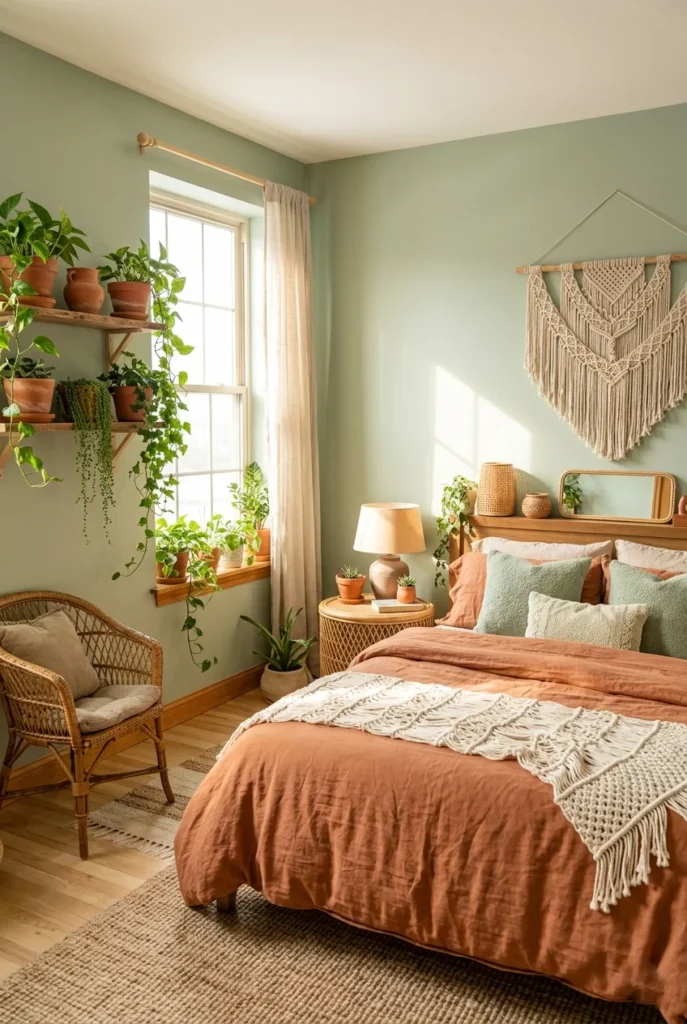
Soft green and terracotta are a combination that belongs outdoors and that is exactly why it looks so good indoors. These are the colors of leaves and earth, plant and pot, nature and structure. Together, they create a room that feels grounded, organic, and full of life.
This is a wonderful palette for bedrooms, sunrooms, or any space with abundant natural light. Soft green walls with terracotta bedding, pottery, and plant pots create a room that feels like a garden room in the best possible sense. The green cools the warmth of terracotta just enough to prevent the combination from feeling heavy or overly hot.
Lean into the natural theme with lots of plants. A green and terracotta room becomes exponentially better with trailing pothos, a fiddle-leaf fig, or a cluster of small succulents in terracotta pots. Wicker furniture, jute rugs, and linen curtains reinforce the palette’s organic quality. This combination is one of the most popular on home decor boards precisely because it feels both personal and aspirational.
28. Steel Blue and White Oak
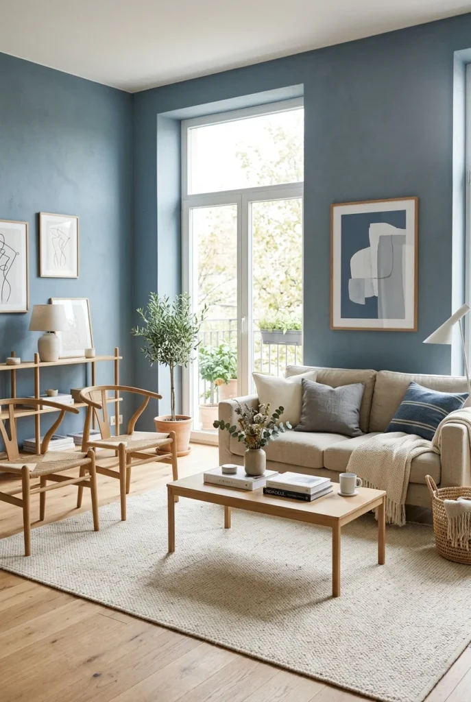
Steel blue and white oak are a Scandinavian design philosophy translated into a color combination. Steel blue is calm and contemplative not as cold as ice blue or as moody as navy, but something in between, feeling grounded and peaceful. White oak is pale, warm, and light, and it lifts the blue without competing with it.
This combination is ideal for living rooms and bedrooms where simplicity and calm are the primary goals. The Scandinavian tradition of pairing cool, muted colors with natural pale wood is one of the most enduring and successful approaches to interior design, and steel blue is one of its most beautiful expressions. The palette is livable year-round, adapting from cozy winter warmth to breezy summer lightness.
Keep accessories minimal one or two ceramics in simple shapes, a single piece of thoughtful wall art, and a well-chosen plant are all you need. The strength of this combination comes from restraint. Every element should earn its place in the room. The result is a space that feels peaceful, complete, and quietly beautiful in the best Nordic tradition.
29. Bright White and Natural Wood
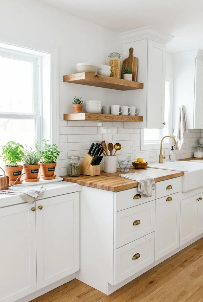
Bright white and natural wood are not technically a color combination it is an entire design philosophy. The purity of white creates a clean, open canvas, and natural wood grain adds warmth, texture, and life without introducing any color that could age or feel dated. This pairing is the reason Scandinavian and Japanese-inspired design has remained popular for decades.
This is the go-to combination for kitchens, bathrooms, and living rooms that feel both fresh and timeless. White walls and cabinetry with exposed wood shelving, flooring, or furniture elements create a layered look that is incredibly easy to live with. Nothing clashes, everything works, and the room always looks clean and organized, even when it isn’t.
The wood species matters a lot here. Lighter woods white oak, ash, birch, maplestay true to the clean spirit of this palette. Darker or more orange-toned woods can feel heavy against pure white. Add simple greenery for the most complete version of this look a white room with natural wood and a few plants is the interior design equivalent of a perfect wardrobe capsule.
30. Wine Red and Cream

Wine red and cream is a combination with an old-world elegance. Wine is a rich, warm red with purple undertones that prevents it from feeling aggressive or sporty. Cream adds softness and light without the harshness of pure white. Together, they create a dining room or living space that feels genuinely romantic and thoughtful.
This palette has a natural home in dining rooms and bedrooms. Wine-red walls create an intimate atmosphere ideal for dinner by candlelight or a cozy evening in. Cream tablecloths, curtains, and upholstery prevent the deep red from dominating, and the contrast between them creates a visual warmth that is almost impossible to achieve with cooler colors.
Dark furniture walnut, mahogany, or ebonized wood fits this palette naturally and adds to the rich, gathered quality of the space. Brass or gold accessories, beeswax candles, and simple floral arrangements in cream and deep red complete the look. This is a combination for anyone who loves the idea of a room that gets better the longer you spend time in it.
31. Warm Nude and Camel with Black Accents

Warm nude, camel, and black is a three-color combination that functions like a full wardrobe for a room endlessly versatile, always appropriate, and incredibly easy to build on over time. Nude and camel are close in tone, creating a warm, tonal base. Black accents provide sharpness and definition, preventing the palette from looking washed out or beige-boring.
This combination is the choice for anyone who wants a neutral room that still has character. The slight contrast between nude and camel creates subtle visual interest, while the black elements a thin-framed table, a light fixture, picture frames give the room a crisp, modern edge. The three-tone approach avoids the flatness of a single-neutral palette.
Black plant pots, black-spiny books, and a single large piece of dark abstract art are enough to anchor the black element without overdoing it. Natural textures bouclé, linen, wool, and rattan add dimension and warmth to the nude and camel base. This combination looks effortless because it pairs well with almost every style of furniture and art, making it one of the most practical Pinterest color palettes for a main living space.