34 Warm Greige Paint Shades That Make Every Room Feel Inviting
Picking the right wall color is harder than it looks. You want something neutral but not boring, warm but not too yellow, and calm but still stylish. That is exactly where greige paint shades come in. Greige is the perfect mix of gray and beige, and it works in almost every room. It feels cozy without feeling heavy. These 34 shades will help you find the one that fits your home perfectly.
Greige tones are very popular in home decor right now because they go well with wood, white trim, and modern furniture. They feel fresh but also timeless. Whether your home is modern, farmhouse, or classic, greige fits in without effort.
If you have been scrolling Pinterest looking for that perfect wall color, you already know how good greige looks in real homes. It photographs beautifully, looks warm in natural light, and makes any space feel pulled together. Let’s go through 34 of the best warm greige paint shades you should know about.
1. Accessible Beige by Sherwin-Williams
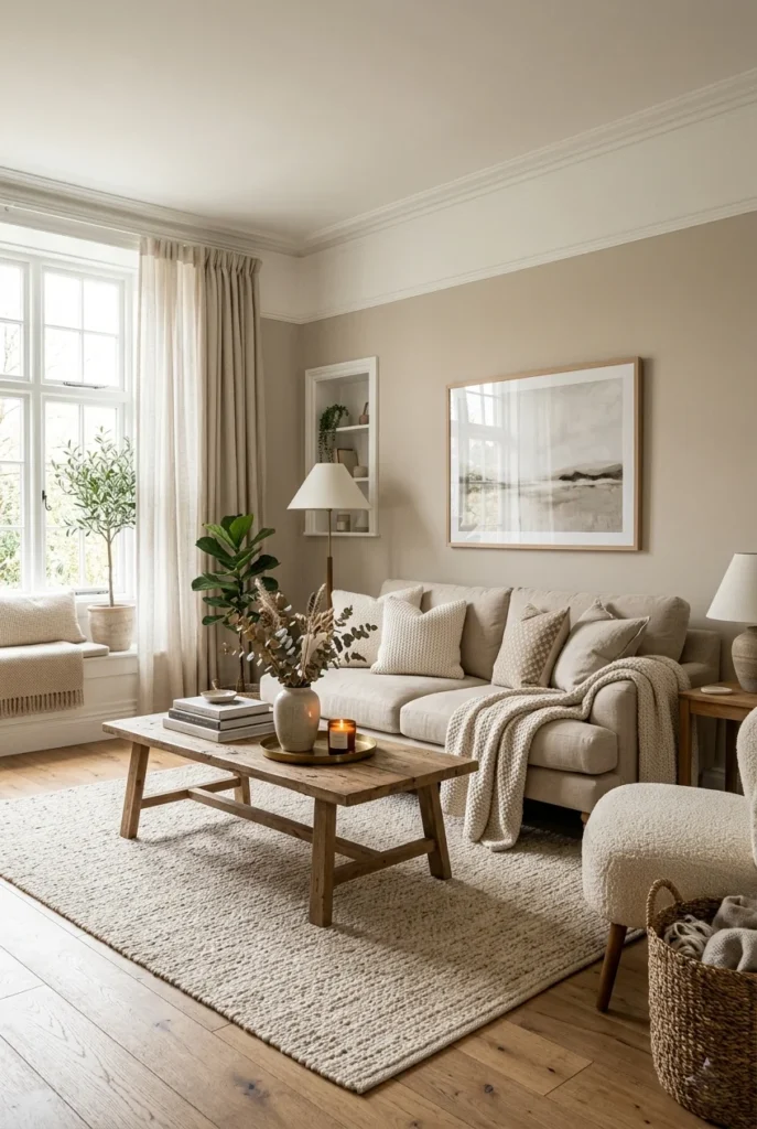
Accessible Beige is one of the most popular greige shades ever made. It leans slightly more toward beige, but the gray undertone keeps it from feeling too warm or orange. It works perfectly in living rooms and dining areas where you want a relaxed, welcoming feel.
This shade looks great with white trim and natural wood tones. It also pairs well with navy, soft green, and terracotta accents. Many homeowners choose it because it looks good in both bright and low-light rooms without shifting too much.
If you are new to greige and not sure where to start, Accessible Beige is a safe and beautiful choice. It has been a top-seller for years and consistently looks beautiful in real home photos shared on Pinterest.
2. Agreeable Gray by Sherwin-Williams
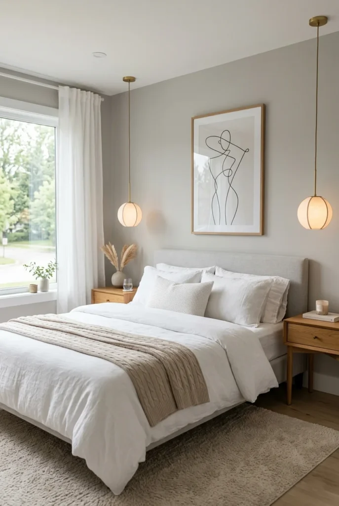
Agreeable Gray might be the most talked-about paint color on Pinterest. It sits perfectly between gray and beige, leaning slightly cool but still feeling warm and soft. It does not look stark or cold like a pure gray would.
This shade works in almost every room — bedroom, kitchen, hallway, or bathroom. It looks different depending on your lighting, which is part of what makes it so versatile. In bright light, it looks almost white-gray, and in dim light, it gets cozier and more beige.
Agreeable Gray pairs beautifully with white cabinets, warm wood floors, and brass or gold fixtures. It is a very forgiving color that makes small rooms feel bigger and large rooms feel cozier and more grounded.
3. Balanced Beige by Sherwin-Williams
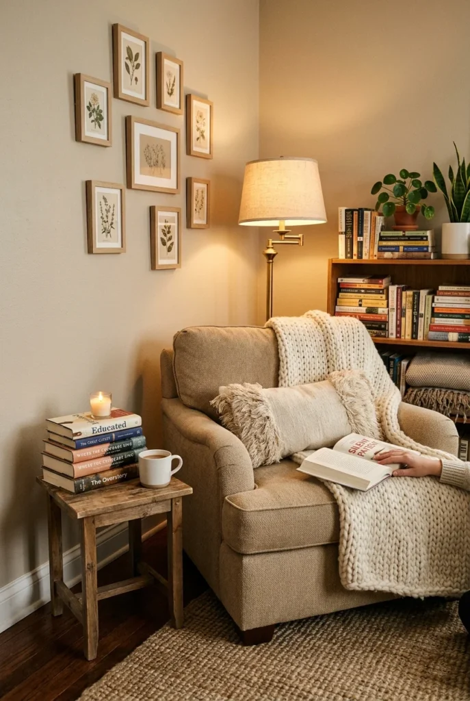
Balanced Beige lives up to its name. It is a true greige that does not pull too far in either direction. It feels grounded and calm, making it a great choice for spaces where you want to feel relaxed and at ease.
It works especially well in bedrooms and living rooms. The warm undertones make the space feel snug, while the gray keeps it from feeling too heavy or dated. It also serves as a great backdrop for colorful artwork or bold furniture.
This shade looks stunning with dark wood furniture and cream-colored textiles. It is a go-to greige for people who want a room that feels like a warm hug the moment you walk in.
4. Anew Gray by Sherwin-Williams
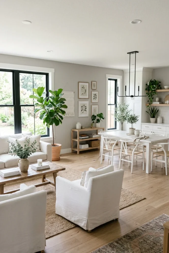
A new gray is a lighter greige that keeps spaces feeling open and airy. It has enough warmth to feel welcoming but stays soft enough to work in smaller rooms without closing them in. It is a favorite for open-plan layouts.
Because it leans lighter, it pairs especially well with white and off-white furniture. It also works great in kitchens where you want the walls to feel clean and fresh without going fully white. Add warm wood tones, and you have a very Pinterest-worthy kitchen.
Anew Gray also performs well in hallways and entryways. These spaces often get less natural light, and Anew Gray keeps them from feeling dark or gloomy. It is a practical and beautiful greige for high-traffic areas.
5. Edgecomb Gray by Benjamin Moore

Edgecomb Gray by Benjamin Moore is a soft, classic greige that feels polished and put-together. It leans slightly toward gray rather than beige, yet retains enough warmth to feel inviting. It works especially well in formal spaces like home offices and dining rooms.
This shade is very popular with interior designers because it gives rooms a refined, finished look. It makes white trim pop beautifully and creates a clean contrast with dark wood or black accents. It is the kind of color that makes a room look professionally decorated.
Edgecomb Gray also works well in bathrooms. It gives the space a calm, spa-like feeling without looking too cold or clinical. Pair it with white subway tiles and warm brass fixtures for a timeless, beautiful look.
6. Pale Oak by Benjamin Moore

Pale Oak is one of Benjamin Moore’s most beloved greige shades. It is a warm, soft tone that leans more toward beige with just a whisper of gray. It feels light and fresh without looking stark or plain. Rooms painted in Pale Oak always look calm and comfortable.
This shade is excellent for open-plan spaces because it flows well from room to room. It does not feel too bold or too bland — it just feels right. It works beautifully with natural wood, rattan furniture, and soft white textiles.
Pale Oak is also a great choice if you love the Scandinavian or organic modern decor style. It gives your space that effortless, clean, and warm feel that is all over Pinterest right now. It is a shade that never goes out of style.
7. Revere Pewter by Benjamin Moore

Revere Pewter has been one of the most popular paint colors for over a decade. It is a medium greige that leans more gray than beige, giving it a slightly more sophisticated feel. It is rich without being dark and warm without being too yellow.
This shade works best in rooms with good natural light, where it shows its warm gray character to its best advantage. In lower light, it can pull a little darker, which actually makes it great for creating a cozy, moody bedroom or study. It has a lot of personality for a neutral.
Revere Pewter looks great with dark wood, white trim, and jewel-toned accents like deep blue or forest green. If you want a greige with a little more depth and presence, this is the one to try.
8. Manchester Tan by Benjamin Moore
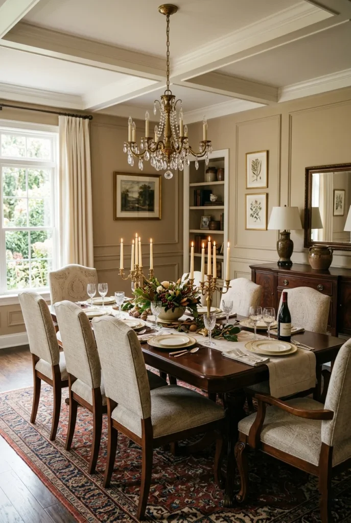
Manchester Tan is a warm, cozy greige that leans more toward tan and beige. It has a golden warmth that makes spaces feel sunny and cheerful even on cloudy days. It is one of those colors that just feels like home from the moment you walk in.
This shade works very well in dining rooms and kitchens where you want a lively, warm energy. It pairs beautifully with cream, brown, and terracotta tones. It also looks lovely with dark walnut furniture and antique-style fixtures.
If your home already has a lot of warm wood tones, Manchester Tan will blend in beautifully and bring everything together. It is a comforting, classic greige that has stood the test of time in home decor.
9. Collingwood by Benjamin Moore
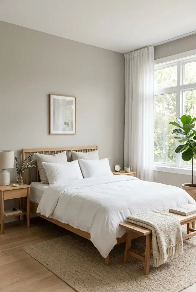
Collingwood is a very soft greige with cool lavender undertones that give it a unique, calm quality. It does not feel as warm as most greige shades, but it still carries enough beige to stay cozy rather than cold. It is a very soothing choice for bedrooms.
Because of its slightly cooler undertone, Collingwood looks especially beautiful in rooms with lots of natural light. The light brings out its soft warmth, making it feel dreamy and peaceful. It is a very popular choice for master bedrooms and nurseries.
This shade pairs well with white, soft gray, and blush pink accents. It creates a quiet, elegant backdrop that works equally well with minimalist and romantic decor styles. If you want a greige that feels a little different, Collingwood is worth exploring.
10. Classic Gray by Benjamin Moore

Classic Gray is a very light greige that sits almost at the edge of white. It is barely there but adds just enough warmth and softness to keep walls from feeling stark or flat. It is a great choice when you want a neutral that is not quite white but still very light.
This shade is widely used in bathrooms and kitchens where a bright, clean look is the goal. It reflects light beautifully, making small spaces feel more open. Yet it still has that hint of warmth that keeps the room from feeling like a hospital.
Classic Gray also works well as a whole-home color if you want a consistent, cohesive look throughout. It is subtle enough not to compete with artwork or bold furniture, making it an incredibly flexible and practical greige choice.
11. Navajo White by Benjamin Moore
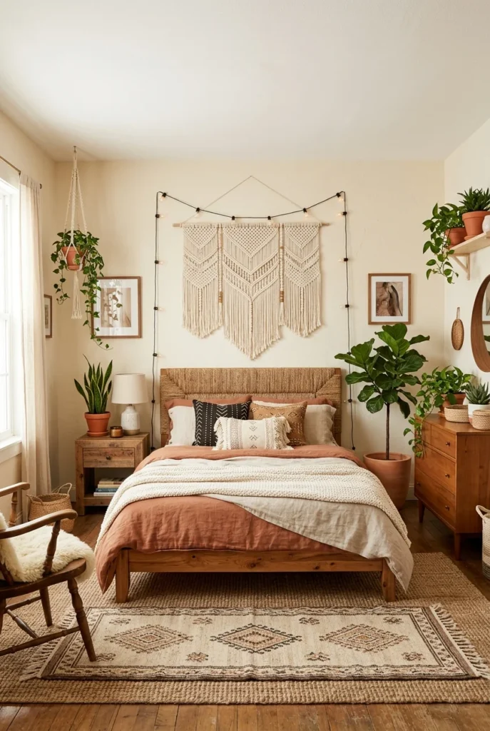
Navajo White is a warm, creamy greige that leans heavily toward beige with just a touch of gray to cool it down slightly. It is a soft, comforting color that feels like warm sunlight on your walls. It is one of the most versatile and universally flattering neutral paint shades available.
This color looks especially beautiful in boho, farmhouse, and earthy decor styles. It pairs perfectly with terracotta, rust, warm wood, and linen textures. It gives any space a relaxed, natural, organic feel that is very popular on Pinterest right now.
Navajo White also works well in spaces with limited natural light, as its warm undertones help brighten the room. It is a paint shade that instantly makes a space feel livable and loved.
12. Muslin by Benjamin Moore

Muslin by Benjamin Moore is a delicate, creamy greige that feels soft and textile-like — much like the fabric it is named after. It is warm and gentle, making it a perfect choice for kitchens, living rooms, and nurseries. It gives spaces a light, breathable quality.
This shade works wonderfully in farmhouse-style kitchens alongside shaker cabinets, open wood shelves, and ceramic accents. It also works beautifully in bedrooms, where its softness creates a restful and relaxing environment. It is a very approachable and livable neutral.
Muslin also complements natural materials extremely well — linen, cotton, wood, and stone all look beautiful next to it. If you love a soft, natural, unfussy palette, Muslin is a greige you will keep coming back to.
13. Cappuccino by Benjamin Moore
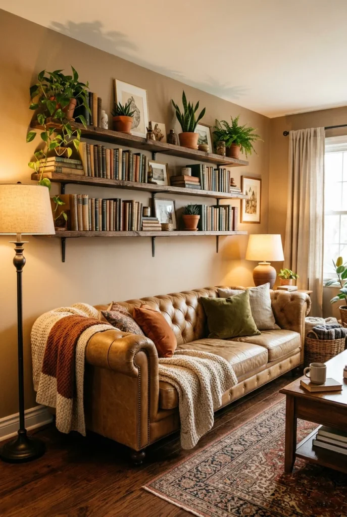
Cappuccino is a deeper, richer greige with strong warm brown undertones. It is named after the beloved coffee drink, and it really does feel that warm and comforting. This is a greige for people who want their walls to have a bit more depth and personality.
This shade works beautifully in living rooms and home libraries where you want a cozy, enveloping feeling. It pairs wonderfully with leather furniture, dark wood shelving, and warm amber lighting. It creates an atmosphere that feels rich and welcoming at the same time.
Cappuccino is a less common choice but a very rewarding one. When you get the lighting right, it looks absolutely stunning — warm, layered, and full of character. It is the kind of greige that turns a plain room into a genuinely memorable space.
14. Nomadic Desert by Sherwin-Williams

Nomadic Desert is a warm, sandy greige that feels earthy and grounded. It has strong beige and tan undertones that evoke open landscapes and warm sunshine. It is a shade that makes rooms feel both relaxed and stylishly layered.
This color is a natural fit for earthy, Southwestern, or organic modern decor styles. It pairs beautifully with terracotta, ochre, cream, and warm wood tones. It also works well with natural fiber rugs, clay pots, and linen furniture. The overall look is very Pinterest-worthy and on-trend.
Nomadic Desert is also a great exterior color for homes in warm, sunny climates. But indoors, it creates a very beautiful, warm, desert-inspired atmosphere that feels both current and cozy.
15. Kilim Beige by Sherwin-Williams

Kilim Beige is one of the warmest greige shades on this list. It leans heavily into beige and tan, giving rooms a genuinely warm, enveloping feel. It is named after the colorful woven kilim rugs, and like those rugs, it adds character and warmth to a space.
This shade works especially well in family rooms and spaces that see a lot of daily life. Its warmth makes the space feel welcoming and comfortable rather than formal or stiff. Pair it with colorful textiles and warm wood furniture for a room that feels lived-in and loved.
Kilim Beige looks beautiful in rooms with natural light pouring in during the day, where it glows with a soft golden warmth. In the evening under lamp light, it becomes even cozier and more inviting — perfect for family gatherings and movie nights.
16. Creamy by Sherwin-Williams
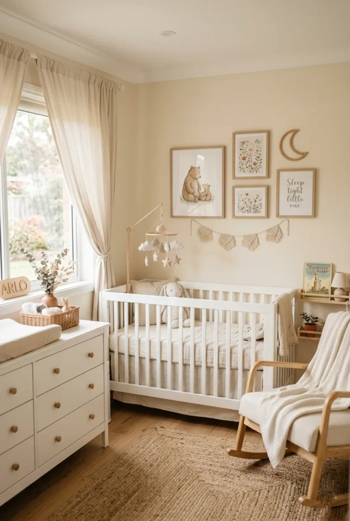
Creamy by Sherwin-Williams is a warm off-white greige that bridges the gap between pure white and beige. It is incredibly soft and gentle, making it one of the most popular choices for nurseries, bedrooms, and low-light spaces that need a warm lift.
This shade has a buttery, creamy quality that feels comforting and calm. It pairs beautifully with white trim, soft pastels, and natural wood tones. It is also a great choice for ceilings in rooms with slightly darker greige walls, where it adds warmth without contrast.
Creamy is especially loved in farmhouse and cottage-style homes where soft, natural color palettes are the goal. It is unfussy, warm, and genuinely beautiful — a greige that always looks like it belongs exactly where you put it.
17. Antique White by Sherwin-Williams
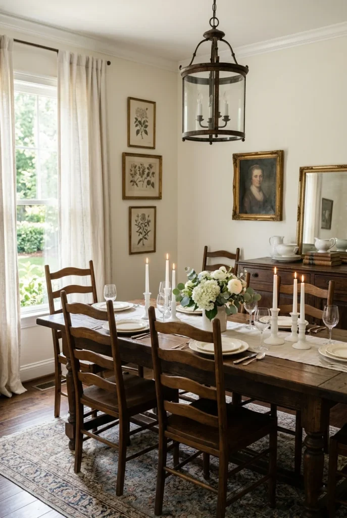
Antique White is a soft, classic greige that leans very close to white but carries enough warmth to feel welcoming rather than cold. It has been a popular choice for decades because it gives rooms a timeless, clean look with just a hint of warmth.
This shade works beautifully in traditional and classic-style homes where white walls feel too stark but bright walls are still a priority. It looks elegant next to dark wood furniture, brass fixtures, and antique-inspired decor. It is the kind of color that feels curated and thoughtful.
Antique White is also a smart choice for walls that run alongside natural wood trim, where a true white might clash. Its subtle warmth bridges the gap beautifully, keeping the overall palette harmonious and visually comfortable.
18. Hazy Hue by Sherwin-Williams
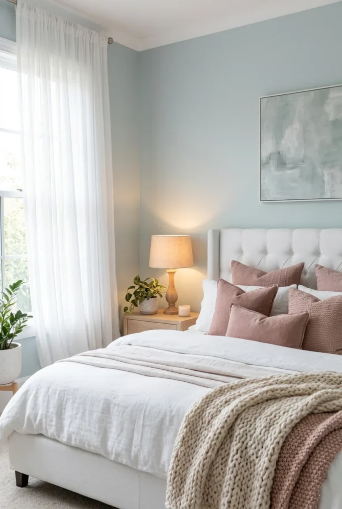
Hazy Hue is a soft, muted greige with a slight purple-gray undertone, giving it a very unique, dreamy quality. It is not a traditional greige, but it falls within the same family of warm neutrals and creates a similarly calming atmosphere in any space.
This shade is perfect for bedrooms that you want to feel soft, romantic, and restful. Its subtle lavender undertone gives it a gentle, feminine quality that pairs beautifully with dusty rose, soft ivory, and warm wood. It feels modern and fresh while still being warm and inviting.
Hazy Hue is a more unexpected greige choice that makes rooms look uniquely styled and thoughtfully decorated. If you want a neutral that stands out from the typical warm beige, this is an inspired and beautiful option.
19. Perfect Greige by Sherwin-Williams
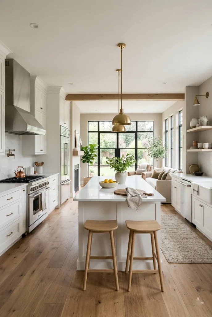
Perfect Greige does exactly what its name says — it is a perfectly balanced mix of gray and beige. It does not lean too far in either direction, making it one of the most consistent and reliable greige shades available. It looks the same under different lighting conditions, making it very easy to work with.
This shade is a great all-rounder for open-plan homes where one color needs to flow through kitchen, living, and dining spaces. It complements white cabinets and countertops beautifully and looks equally at home alongside dark wood floors. It is clean, calm, and stylish all at once.
Perfect Greige is also one of the best greige shades for rental properties and home staging because it appeals to almost everyone. It is safe, beautiful, and always looks polished and well-chosen no matter the room or the furniture.
20. Worldly Gray by Sherwin-Williams

Worldly Gray is a mid-tone greige that leans slightly more toward gray than beige, yet still retains plenty of warmth. It has a sophisticated, polished feel that works very well in contemporary and modern spaces. It is a grown-up greige that does not feel plain.
This shade looks excellent with charcoal, deep navy, and black accents, which give it a sharp, modern edge. It also pairs well with warm wood tones and brass fixtures for a more transitional look. It is one of the more versatile greige shades, effortlessly bridging modern and traditional styles.
Worldly Gray is a great choice if you want your home to look stylish and current without going bold. It carries enough depth to give rooms visual interest while staying firmly in the neutral, easy-to-live-with category.
21. Alpaca by Sherwin-Williams

Alpaca by Sherwin-Williams is a very light, soft greige that feels almost like a warm white. It is gentle, calm, and incredibly easy to live with. It does not demand attention but adds a quiet warmth that makes spaces feel finished and comfortable.
This shade works very well in home offices and creative spaces where you want a calm, clear backdrop without the starkness of bright white. It keeps the mind relaxed while still feeling clean and professional. It also reflects light well, keeping workspaces feeling bright and energized.
Alpaca also works beautifully throughout an entire home as a consistent, cohesive neutral. Every room feels connected and calm without being repetitive. It is the kind of greige you barely notice but would miss immediately if it were gone. were gone.
22. Versatile Gray by Sherwin-Williams
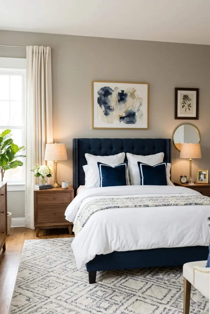
Versatile Gray lives up to its name by working beautifully across many decor styles. It is a balanced mid-tone greige with slightly more gray presence, but enough warmth to prevent it from feeling cold or flat. It is a reliable, good-looking neutral that suits almost any room.
This shade pairs particularly well with navy blue, which is a very popular combination right now on Pinterest and in interior design. The contrast between the soft greige wall and the deeper navy creates a rich, layered look that feels both current and classic.
Versatile Gray also works well in bathrooms and hallways. In bathrooms, it creates a calm, spa-like atmosphere. In hallways, it makes a welcoming first impression without being too strong or overwhelming. It truly earns its name.
23. Wheat Bread by Sherwin-Williams
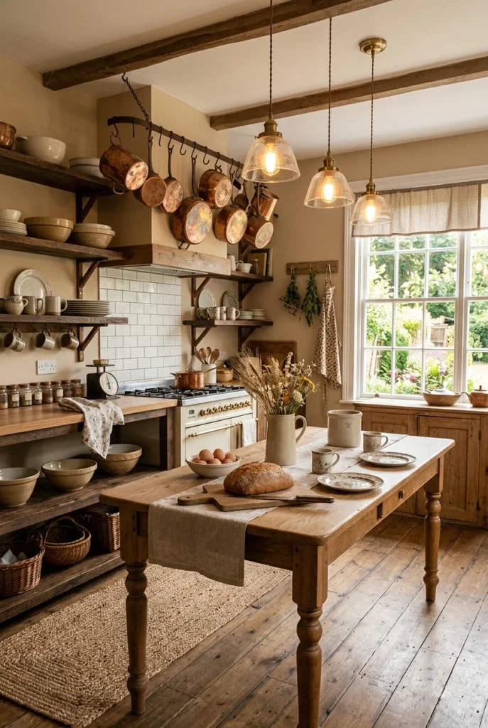
Wheat Bread is a rich, warm greige with strong amber and golden undertones. It feels like the color of freshly baked bread — warm, comforting, and full of life. It is deeper than many greige shades, giving rooms a cozy, layered feel.
This shade is a great choice for kitchens where warmth and energy are welcome. Paired with copper, bronze, or aged brass fixtures and warm wood shelves, it creates a kitchen that feels rustic, personal, and full of character. It is a very photogenic color that always looks great in home decor photos.
Wheat Bread also works beautifully in dining rooms and eat-in kitchens. Its warmth makes meals feel more convivial and inviting. If you want a kitchen that feels like the heart of the home, this greige shade is worth considering.
24. Sand Dollar by Sherwin-Williams

Sand Dollar is a soft, sandy greige that evokes warm beach afternoons. It is light, clean, and refreshing without being too cool or too stark. It has warm tan undertones that keep it feeling cozy, making it a wonderful choice for coastal and relaxed home styles.
This shade looks beautiful in bedrooms with natural fiber furniture and blue or aqua accents. The combination feels immediately coastal and relaxing — perfect for a beachside retreat or a home that simply wants that laid-back, sunny energy year-round.
Sand Dollar is also very popular for exterior house colors in coastal areas. But inside, it brings a breath of fresh air to any room. It is light, happy, and effortlessly stylish — a greige that makes you feel like you are on vacation every time you walk in.
25. Antler Velvet by Sherwin-Williams
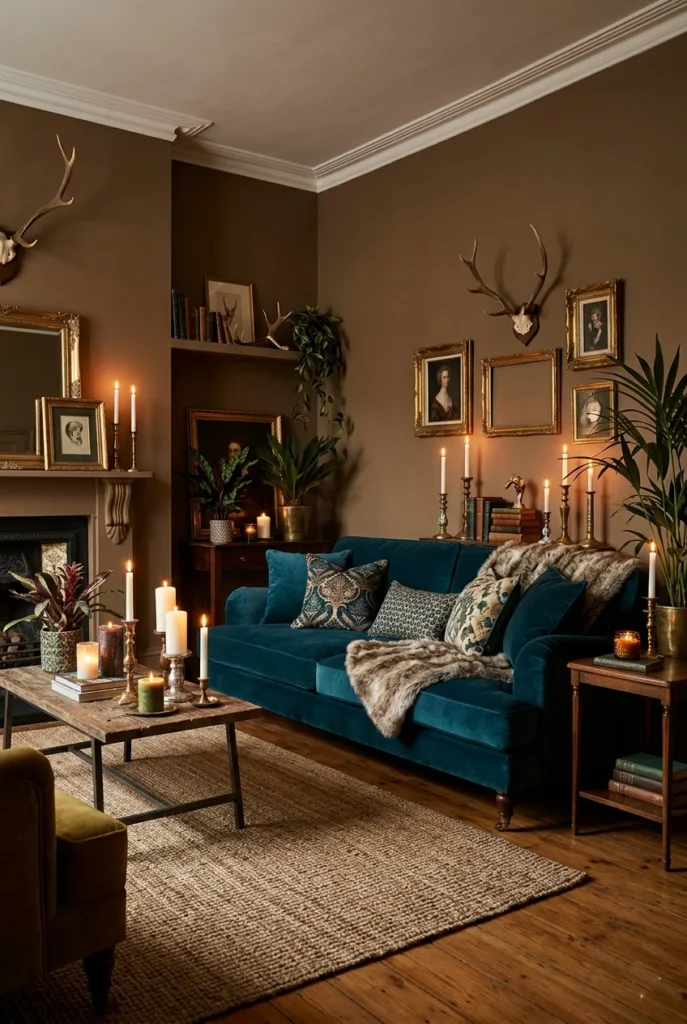
Antler Velvet is a deeper, more dramatic greige that has a complex mix of brown, gray, and warm undertones. It gives rooms an earthy, grounded feel that is simultaneously cozy and bold. It is a greige for people who want their walls to have real presence and depth.
This shade works beautifully in living rooms and bedrooms where you want a moody, rich atmosphere. It pairs wonderfully with jewel tones like deep teal, forest green, and burgundy, creating a layered, maximalist-leaning look that still feels warm and natural.
Antler Velvet is also a great accent wall color. If you want one wall to stand out while the rest of the room stays lighter, this greige delivers impact without going too dark or too bold. It is a sophisticated, confident neutral.
26. Cord by Farrow & Ball
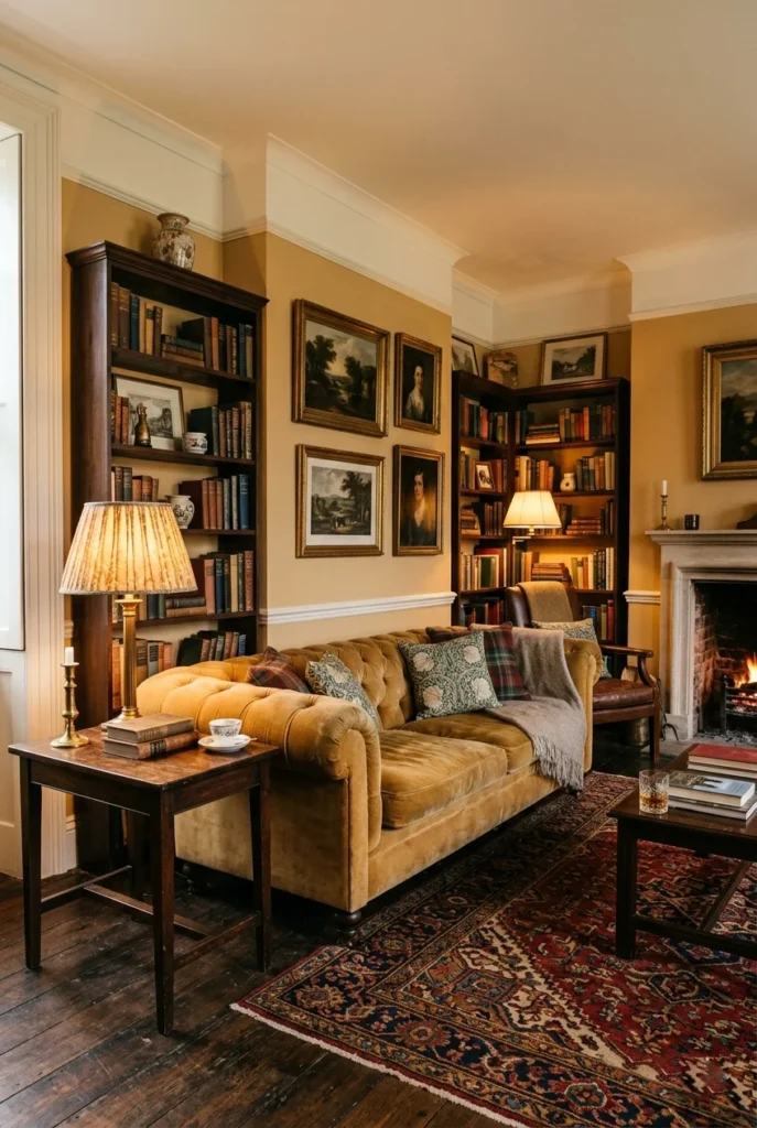
Cord by Farrow & Ball is a warm, dusty greige with creamy yellow undertones. It feels like an old, faded linen — comfortable, relaxed, and full of quiet charm. It is a very British neutral that makes rooms feel lived-in and layered in the best possible way.
This shade works beautifully in traditional and classic British-style interiors. It pairs wonderfully with dark woods, aged leather, and antique brass. When used alongside Farrow & Ball’s signature whites and darker greens, it creates a deeply harmonious and classic color story.
Cord is also a very beautiful choice for hallways and stairwells, where its warm, dusty quality creates an inviting atmosphere as you move through the home. It feels unpretentious and genuinely warm — a greige that ages gracefully.
27. Elephant’s Breath by Farrow & Ball
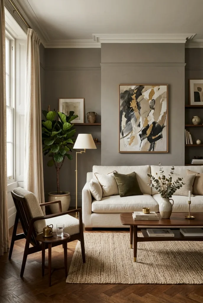
Elephant’s Breath is one of Farrow & Ball’s most iconic paint colors. It is a cool-leaning greige with complex gray and lilac undertones that give it a refined, almost mysterious quality. It is a deeply sophisticated neutral that makes rooms look genuinely beautiful.
This shade looks best in rooms with good natural light, where it reveals its layered, complex character. It pairs beautifully with warm whites, dark wood, and gold or brass metal tones. The combination creates a very polished, designer-inspired look without being overly formal.
Elephant’s Breath is a greige for people who appreciate subtlety and quality. It is not for everyone — some rooms it will look slightly cool and lavender, and in others it will look warm and gray. Getting the light right is the key to unlocking its full beauty.
28. Mole’s Breath by Farrow & Ball
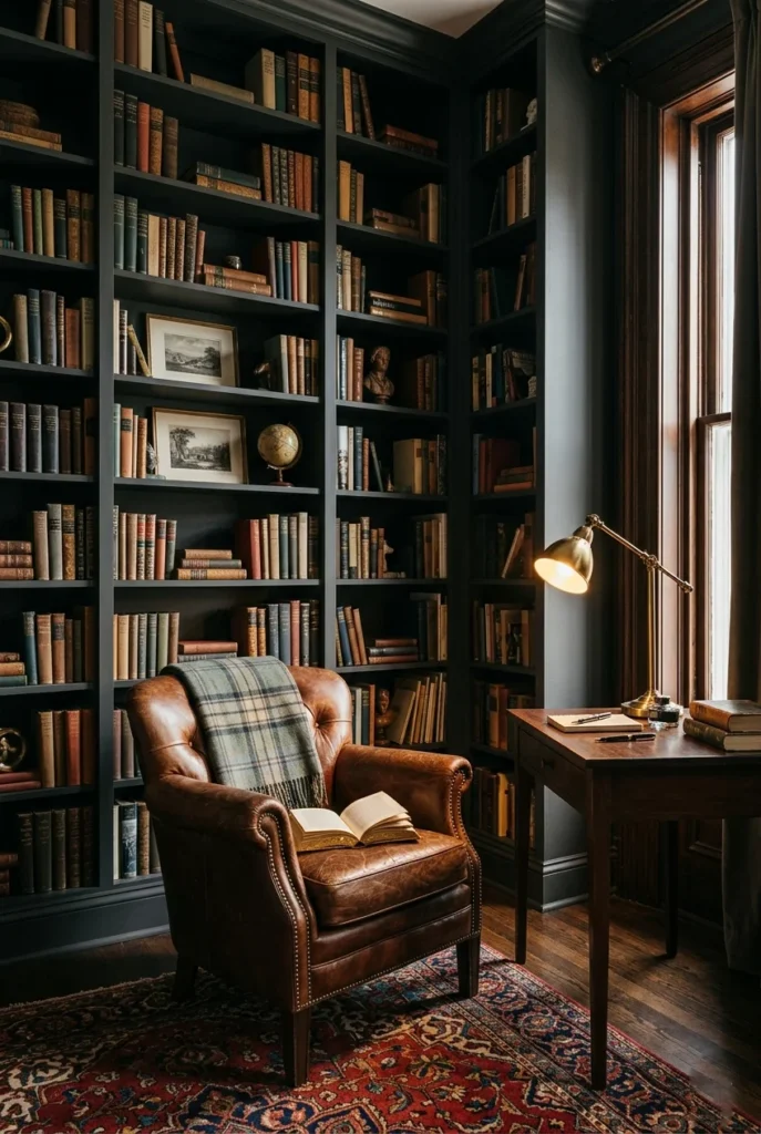
Mole’s Breath is a dark, dramatic greige from Farrow & Ball with deep gray and brown undertones. It is one of the moodiest greige shades on this list, creating an atmosphere that feels genuinely sophisticated and enveloping. It is perfect for rooms where drama and depth are the goal.
This shade looks stunning in libraries, home offices, and dining rooms where you want a dark, intimate feel. Paired with warm brass fixtures, rich leather furniture, and warm wood, it creates a deeply layered space that feels like a private retreat from the world.
Mole’s Breath can also be used as an accent wall in a lighter room to add depth without committing fully to a dark room. Either way, it is a greige that makes a strong, confident statement and looks absolutely beautiful in the right setting.
29. Skimming Stone by Farrow & Ball
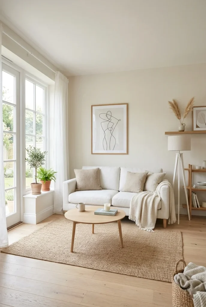
Skimming Stone is a very light, barely-there greige from Farrow & Ball. It is almost white but carries just enough warm stone and beige undertones to feel soft and lived-in rather than clinical. It is one of the best Farrow & Ball shades for light-filled, open spaces.
This shade is perfect for minimalist and Scandinavian-style interiors where restraint and simplicity are the goals. It creates a serene, light-washed atmosphere that feels endlessly calm. Natural wood, white linen, and simple greenery look extraordinary against it.
Skimming Stone is also a wonderful choice for connecting rooms, open-plan spaces, and hallways where you want consistency and flow. Its lightness keeps the whole home feeling open, breathing, and beautifully simple.
30. String by Farrow & Ball

String by Farrow & Ball is a warm, mid-tone greige with earthy, sandy undertones. It feels natural and organic, like sand or raw linen, and creates a very grounded, calming atmosphere. It is one of those colors that feels very connected to the natural world.
This shade pairs beautifully with natural textures — linen, rattan, jute, and raw wood all look stunning alongside it. It also works well with muted, earthy tones like sage green, ochre, and soft terracotta. The overall feel is organic, calm, and rooted.
String is popular among homeowners who gravitate toward natural, sustainable, and organic living. It feels in harmony with nature and creates spaces that feel genuinely restful and grounded. It is a greige that appeals equally to minimalists and lovers of layered, textural decor.
31. Joa’s White by Farrow & Ball

Joa’s White sits at the very light end of the greige family. It is a warm, creamy near-white that carries just enough beige to feel soft and welcoming rather than cold. It is gentle, delicate, and endlessly versatile — the kind of color that works in almost any room.
This shade is especially loved in bedrooms and bathrooms where a clean, fresh feeling is the priority but pure white feels too stark. It creates a soft, romantic atmosphere that is flattering and relaxing. Antique furniture, delicate fabrics, and floral accents all look beautiful beside it.
Joa’s White also works beautifully as a ceiling color in rooms with slightly deeper greige walls. It lifts the space without creating a jarring contrast, keeping the whole room feeling cohesive and soft. It is a quietly excellent greige that earns its place in any home.
32. Savanna by PPG
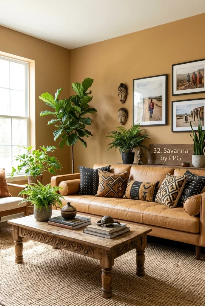
Savanna by PPG is a warm, sandy greige that feels open, sunny, and full of life. It has strong tan and earth undertones that give it a very natural, outdoor quality. It is the kind of color that makes you think of wide open spaces and warm sunshine.
This shade is a beautiful choice for rooms that lean into earthy, global, or maximalist decor styles. It pairs wonderfully with rich prints, natural materials, and bold plant life. It also works well with camel, rust, and warm brown tones for a rich, layered palette.
Savanna is also an excellent choice for sun-drenched rooms or homes in warm climates. Its warmth feels right at home in spaces that get a lot of natural light. It is a bold but grounded greige choice that makes rooms feel vibrant and alive.
33. Pebble Shore by Behr
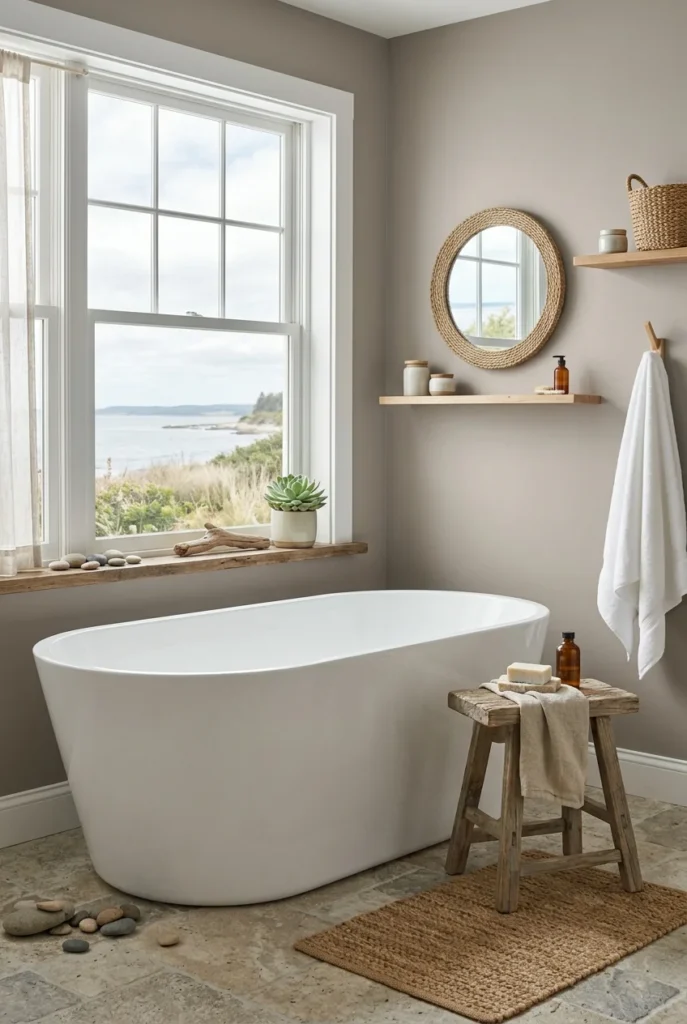
Pebble Shore by Behr is a cool, stone-toned greige that feels calm and natural. It has gray and pebble undertones that give it a slightly more coastal, mineral quality compared to warmer greige shades. It is a beautiful choice for bathrooms and spaces inspired by nature.
This shade looks stunning in bathrooms with natural stone tiles, wood accents, and white fixtures. It creates a spa-like, mineral-rich atmosphere that feels genuinely luxurious without being overdone. It is also a very budget-friendly greige option that delivers a high-end look.
Pebble Shore is also a good choice for exterior walls and entryways, where its stone-like quality feels grounded and sturdy. Indoors, it is calm, cool, and quietly beautiful — a greige that brings the feel of a pebbled shoreline right into your home.
34. Natural Linen by Behr

Natural Linen by Behr is the perfect final greige on this list because it captures everything the color family stands for. It is warm, soft, clean, and completely effortless. It has the look and feel of real linen fabric on your walls — textural, breathable, and naturally beautiful.
This shade works beautifully in living rooms and bedrooms that lean into the organic modern or Japandi design aesthetic. Paired with natural linen furniture, jute rugs, dried botanicals, and warm wood, it creates a space that feels calm, natural, and intentionally beautiful.
Natural Linen is also one of the most forgiving and easy-to-live-with greige shades available at a very accessible price. It looks great in bright and dim rooms, with modern and traditional furniture, and at every hour of the day. It is a greige that truly earns the title: perfect neutral.