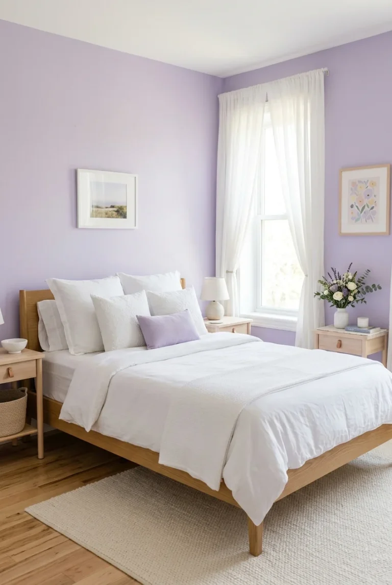
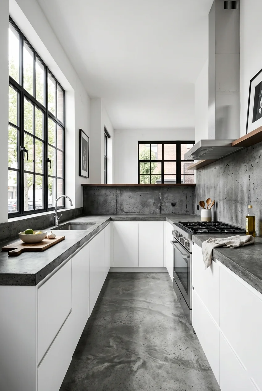
30 Kitchen Color Palette Ideas to Inspire Your Next Makeover
Does your kitchen feel tired, outdated, or just plain boring? You’re not alone. The right kitchen color palette can change everything without a full renovation. Color is the most affordable way to transform your space. Start here.
Choosing a new color palette doesn’t have to be stressful. It’s about finding combinations that match your personality and the feeling you want each morning. From bold and dramatic to soft and earthy, there’s a palette here for every home.
We’ve rounded up 30 Pinterest-worthy kitchen color palette ideas — all achievable, all trending. Whether you’re planning a full makeover or just a fresh coat of paint, these ideas give you a clear starting point.
1. Classic White and Wood Tones
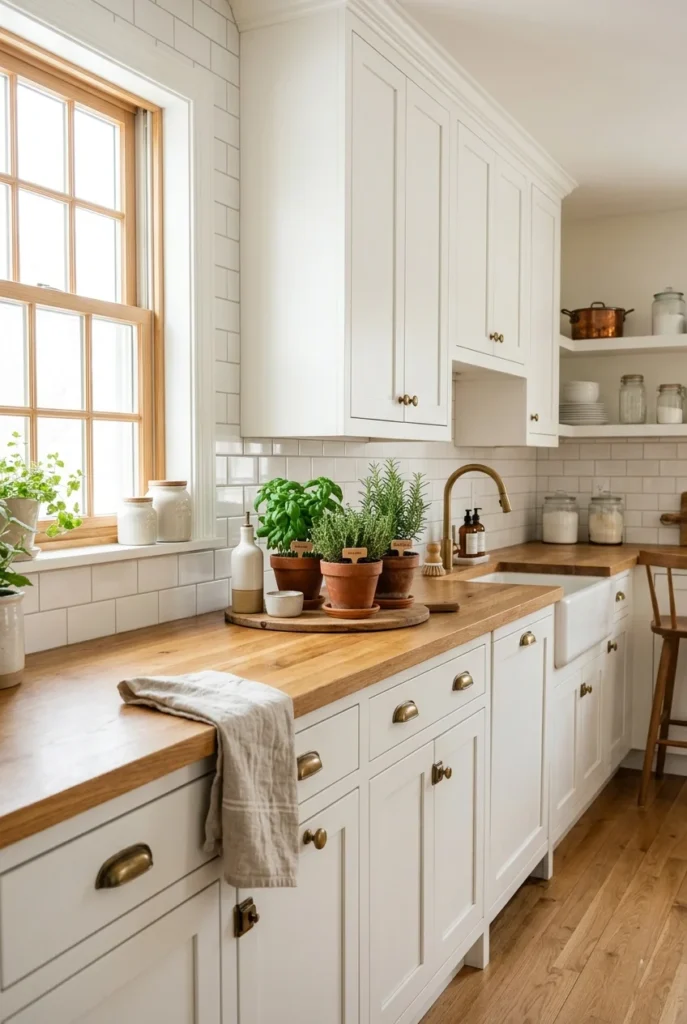
White kitchens never go out of style. Pairing white with natural wood tones is one of the most timeless kitchen color palette ideas you can try. The contrast is clean, warm, and welcoming all at once — and it works in any size kitchen.
You don’t need to spend a fortune here. Paint your cabinets white and replace the countertops with butcher block or oak. Even a few wooden open shelves against white walls create that balanced, earthy look people save on Pinterest every day.
The best part is how flexible this palette is. You can add any accent color — sage green, terracotta, navy — and it works instantly. It’s the perfect base if you like refreshing your decor with the seasons.
2. Sage Green and Cream
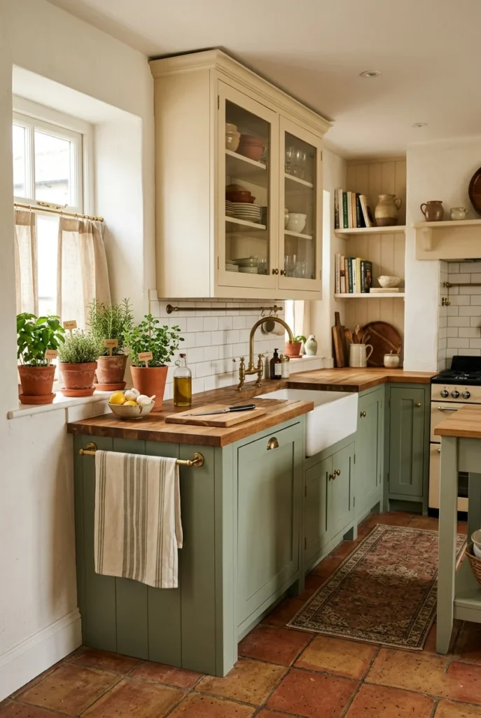
Sage green has taken over Pinterest kitchens for good reason — it feels calm, organic, and genuinely beautiful. Paired with cream or off-white, the result is soft and inviting without being boring. It brings nature indoors without going overboard.
Paint lower cabinets in sage and keep uppers in cream. Add brass or matte gold hardware, and you have a kitchen that looks expensive without the price tag. A linen or cream backsplash keeps the whole palette cohesive.
Sage green also works beautifully with earthy accessories — wooden cutting boards, woven baskets, terracotta cookware. It photographs so well that it’s one of the most saved kitchen color ideas on Pinterest right now.
3. Navy Blue and Brass
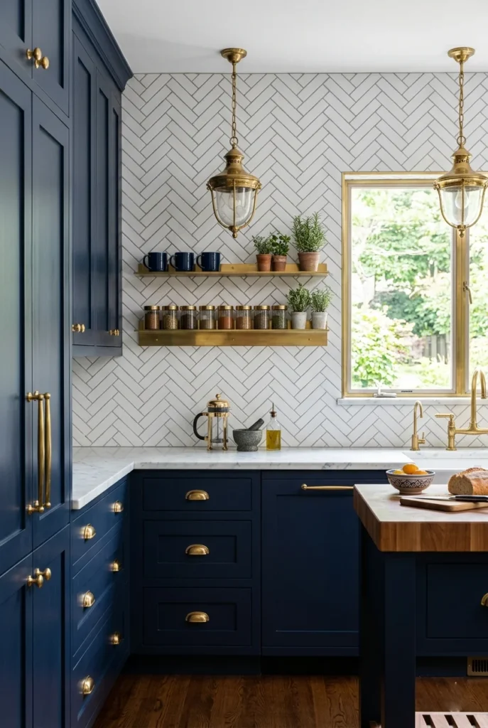
Navy blue kitchens feel bold and sophisticated without being overwhelming. Pair that deep blue with warm brass accents, and the space stays warm instead of cold. This is one of those kitchen color palette ideas that always stops the scroll.
Navy shaker cabinets with brass pulls are a proven combo. Add white marble countertops to brighten the space. A white backsplash ties everything together while letting the blue be the star of the room.
If your kitchen lacks natural light, use navy only on the island or lower cabinets, and keep the upper cabinets white. You still get the drama without closing the space in. Smart and stunning at the same time.
4. All-Black Matte Kitchen
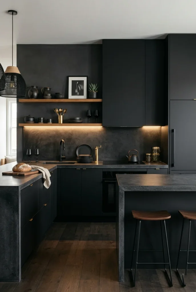
All-black kitchens are bold, dramatic, and surprisingly livable when done right. Matte black finishes absorb light in a way that feels sleek and modern — not cave-like. This palette is for those who want their kitchen to make a real statement.
The trick is texture. Mix matte cabinets with rough concrete countertops, an open wood shelf, and a textured backsplash. These layers stop the space from feeling flat or monotonous, no matter how dark it goes.
Lighting is everything here. Under-cabinet lights, warm-bulb pendants, and natural light will completely transform this palette. When lit well, a black kitchen looks straight out of an interior design magazine.
5. Warm Terracotta and White
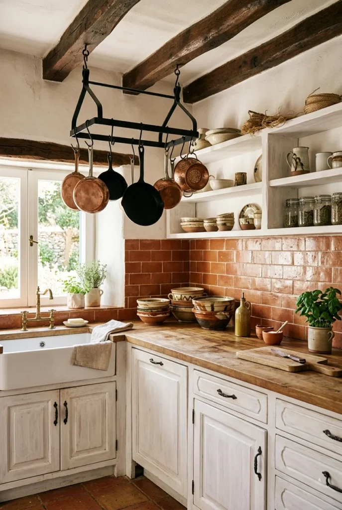
Terracotta is one of the warmest and most inviting colors for a kitchen. Paired with white walls or white cabinets, it creates a Mediterranean or rustic feel full of personality. This palette brings warmth and soul to any cooking space.
Use terracotta as a backsplash tile, a cabinet color, or just through accessories like pots and textiles. It pairs beautifully with natural linen, warm wood, and touches of forest green throughout the space.
Terracotta and white also work well in smaller kitchens — the earthy warmth makes the space feel cozy rather than cramped. It’s a color that feels handmade and human, which is exactly why it performs so well on home decor platforms.
6. Soft Gray and White
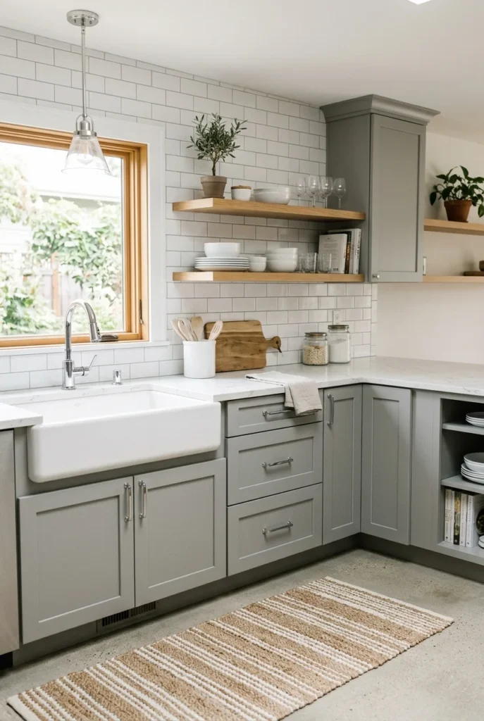
Gray and white kitchens feel polished, calm, and effortlessly modern. This palette works with almost every style — Scandinavian, contemporary, transitional, farmhouse. It’s a safe choice that still looks completely intentional and put together.
Soft, warm grays work better in kitchens than cool blue grays, which can feel clinical. Pair dove gray or greige cabinets with bright white countertops. Add chrome or brushed nickel hardware for a clean, consistent finish.
Gray and white also leave plenty of room for personality. Mustard yellow dish towels, a green plant on the windowsill, or a patterned rug can bring this neutral palette to life without overwhelming the space.
7. Two-Tone Cabinets: Dark Bottom, Light Top

Two-tone cabinets are a Pinterest favorite because they add visual interest without a full renovation. Darker lowers and lighter uppers visually ground the space while keeping the upper half bright and open. It’s one of the smartest kitchen layout tricks around.
Navy or forest green on the bottom with white or cream on top is the most popular pairing. But charcoal and white, black and sage, or blush and white all work beautifully too. Just keep the tones within the same temperature range.
This palette also lets you update in phases — do the lower cabinets first, live with it, then tackle the uppers. It’s practical, affordable, and one of the most effective ways to refresh a dated kitchen.
8. Blush Pink and Gold
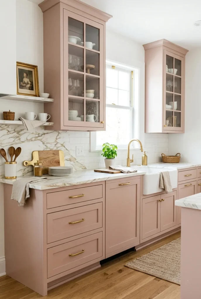
Blush-pink kitchens are having a real moment — the color is soft, warm, and surprisingly sophisticated, with gold accents. This kitchen color palette is for those who want their space to feel genuine and feminine.
Dusty or muted blush works better than bright pink in kitchens — it reads more like a warm neutral. Pair it with white marble, gold hardware, and glass-front cabinetry for a look that feels curated and high-end without the high-end price.
You don’t have to commit to full pink cabinets either. A pink backsplash tile, blush bar stools, or pink open shelving gently bring this palette in. It’s easy to love and even easier to build on over time.
9. Forest Green and Natural Stone
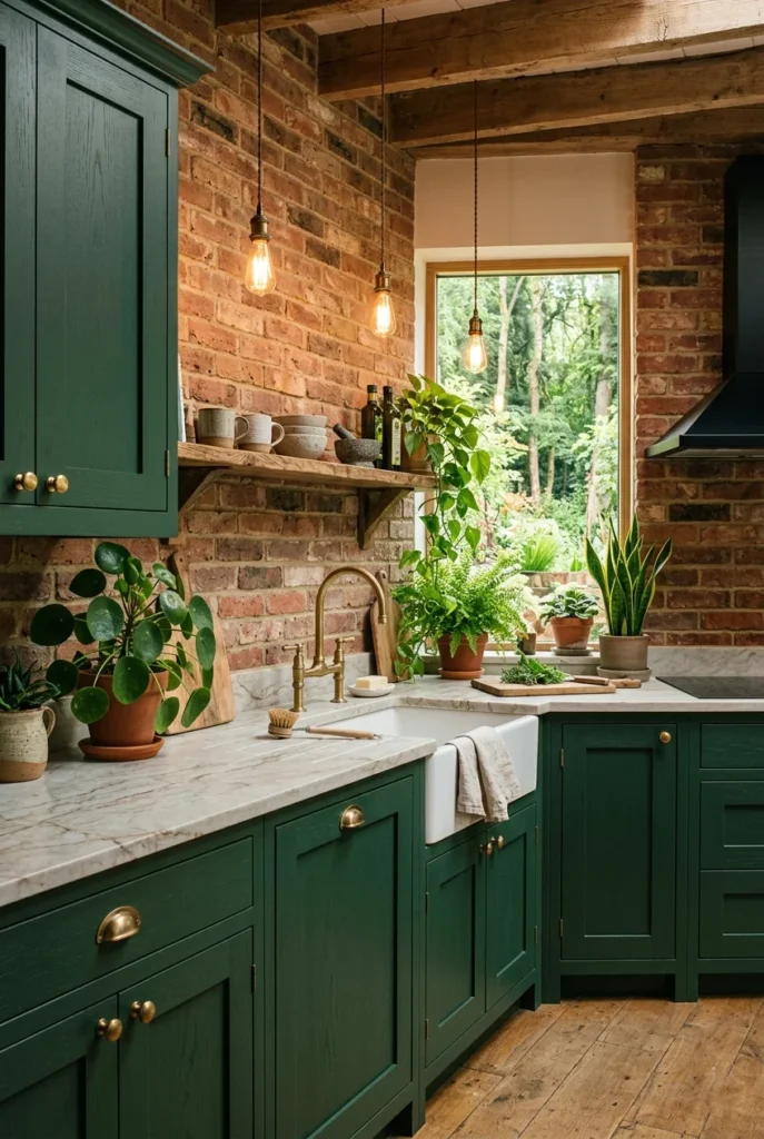
Deep forest green is one of the most striking kitchen colors right now. It feels bold and grounded — like bringing the outdoors inside. Paired with natural stone countertops, this palette has a rich, earthy quality that feels both fresh and completely timeless.
Forest green pairs beautifully with unlacquered brass hardware that develops a natural patina over time. Stone in warm beige, cream, or soft gray balances the green’s intensity and keeps the look organic rather than overly formal or designed.
This palette photographs incredibly well, making it a staple on Pinterest home decor boards. It’s especially beautiful in kitchens with warm afternoon light, which brings out the full depth and richness of those green tones.
10. Warm Butter Yellow and White
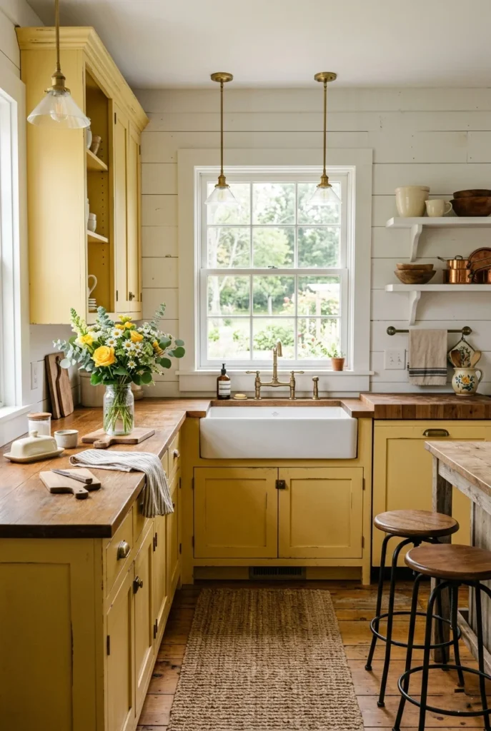
Soft butter yellow — not bright primary yellow — makes a kitchen feel genuinely happy and welcoming. It’s like morning sunshine built right into your walls. This kitchen color palette immediately puts people in a good mood the moment they walk in.
Butter yellow cabinets with white countertops and white walls keep the look balanced and fresh. Add natural wood accents, iron fixtures, and simple farmhouse decor to keep things grounded. It works especially well in cottage and country-style homes.
Start with just a yellow island while keeping the rest of the cabinets white if you’re not ready to fully commit. You still get all the warmth and personality without going all in. It’s the most approachable way to introduce this color.
11. Charcoal and Warm Wood
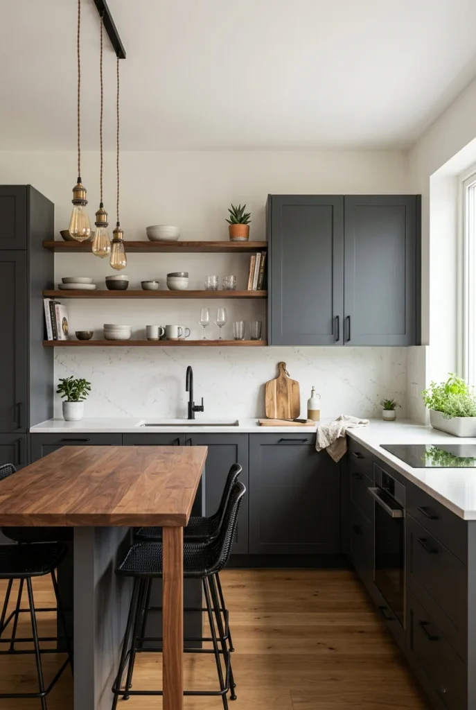
Charcoal gray and warm wood feel both contemporary and inviting at once. The dark gray grounds the space while the wood softens it, keeping the kitchen from feeling too cold or industrial. It’s a top choice for modern farmhouse and urban loft kitchens.
Try charcoal lower cabinets with a walnut island top, or open wooden shelves against charcoal walls. Matte black hardware ties both tones together seamlessly. The result is a kitchen with depth, warmth, and a genuinely modern feel throughout.
This palette also ages gracefully. Unlike trendy colors that feel dated in a few years, charcoal and warm wood will likely look just as current a decade from now. It’s a smart long-term investment for any kitchen makeover.
12. Cobalt Blue and White
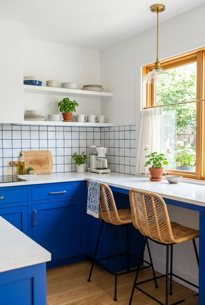
Cobalt blue is bold and joyful — and it works beautifully in a kitchen when balanced with plenty of white. It has a Mediterranean coastal quality that makes a kitchen feel bright, lively, and energetic. Perfect for those who want more than navy.
Keep walls, countertops, and backsplash mostly white to let the cobalt really pop. Chrome or stainless steel hardware works better here than brass. Natural textures, like rattan or linen, help soften the overall look.
Cobalt and white work especially well in small kitchens because their brightness keeps the space feeling open. It’s a palette that makes people smile the moment they walk in — which is exactly what a good kitchen should do.
13. Olive Green and Cream
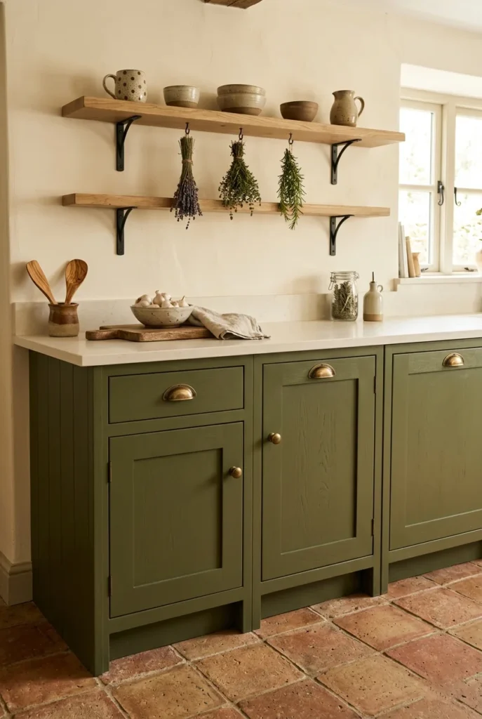
Olive green feels both vintage and current at once. It’s deeper than sage with warm yellow undertones that pair beautifully with cream and natural materials. This palette is for kitchens that want to feel lived-in, grounded, and full of character.
Olive-green cabinets with cream countertops and antique-brass hardware photograph beautifully. Add terracotta floor tiles or a warm wooden floor to complete the earthy feel. Open wooden shelves with handmade ceramics reinforce the natural aesthetic perfectly.
This palette works especially well in vintage or cottage-style homes where the kitchen should feel like it has history. It pairs naturally with checkerboard floors, farmhouse sinks, and vintage-style light fixtures throughout the space.
14. Greige and Warm White
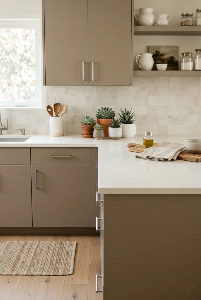
Greige — the blend of gray and beige — is one of the most popular neutral kitchen colors because it’s warm enough to feel cozy but cool enough to feel modern. It pairs perfectly with warm white walls and countertops in almost any kitchen style.
The beauty of greige is that it makes decisions easy. Almost any hardware finish — gold, black, nickel, chrome — works with it. Almost any countertop material pairs well. If you’re feeling overwhelmed by choices, greige is the most reliable and beautiful anchor you can choose.
Greige also reads differently throughout the day — almost warm white in the morning, deeper and more golden by evening. It’s a dynamic, living color that feels like it belongs in a kitchen that gets used and loved every single day.
15. Black and White Checkerboard
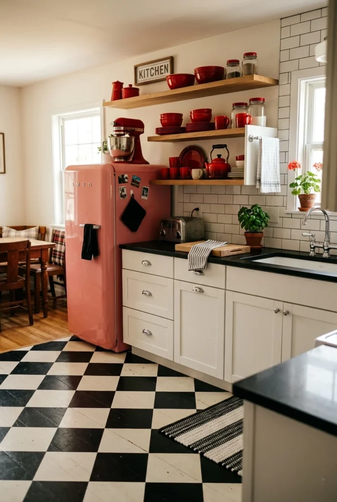
Black-and-white checkerboard kitchens are having a major revival — the pattern brings a retro, diner-style energy that feels nostalgic and surprisingly fresh at the same time. It instantly becomes the visual centerpiece of any kitchen it’s used in.
Use the checkerboard on the floor while keeping cabinets white and walls neutral. This lets the floor do all the talking without competing with everything else. Add vintage-style fixtures and a pop of red or teal in your accessories for a complete look.
Checkerboard tile is also available in many color combinations beyond black and white — such as navy and cream, green and white, and black and terracotta. But the classic version remains the most striking and widely shared on home decor platforms.
16. Dusty Blue and Linen
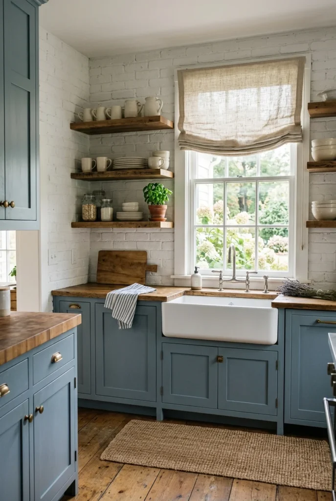
Dusty blue sits in a beautiful middle ground — softer than navy, quieter than cobalt. Paired with linen tones, warm creams, and soft beiges, this palette has a relaxed coastal quality that feels effortlessly calming and easy to live with every day.
Dusty blue cabinets with white painted brick, aged wood shelving, and linen window treatments create a layered, textural look that feels deeply considered. The palette shifts throughout the day — cooler in the morning, warmer and more amber by evening light.
This works especially well for coastal homes, cottages, and bungalows where the goal is to feel relaxed and at ease. It also bridges indoor and outdoor spaces beautifully when your kitchen opens onto a garden or patio dining area.
17. Rich Burgundy and Cream
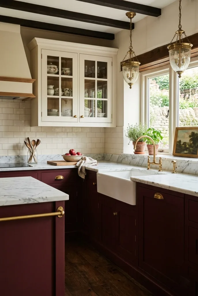
Burgundy kitchens are unexpected and stunning. The deep wine-red tone brings richness and warmth that no other color quite matches. Paired with cream upper cabinets and marble countertops, the combination feels luxurious without looking overdone or trying too hard.
Use burgundy on lower cabinets or your kitchen island for a more balanced approach. Antique gold or bronze hardware reinforces the warm, vintage quality of the color. Dark hardwood floors or warm stone tiles complete the rich, layered look throughout.
Burgundy also pairs beautifully with greenery. A few large potted plants or fresh herbs on the counter add life and contrast against those deep red tones. It’s a palette for kitchens that want genuine personality and warmth above everything else.
18. Pale Pink and Marble
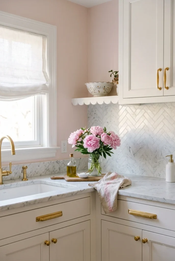
Pale pink walls — rather than pink cabinets — are the softer, more subtle way to bring this color into your kitchen. Paired with white marble and white cabinetry, the pink reads as a gentle warmth rather than a bold statement. The result feels genuinely romantic and refined.
White marble with soft pink or peach veining echoes the wall color in a natural, subtle way. Gold or polished brass hardware adds warmth and a touch of glamour without feeling excessive or overdone in the space.
Fresh flowers are almost mandatory with this palette — peonies, ranunculus, or cream roses look spectacular against blush walls. This kitchen always photographs beautifully, which is why it’s one of the most-pinned kitchen color ideas online.
19. Earthy Neutrals: Sand, Clay, and Stone

A kitchen built around earthy neutrals — sand, clay, and stone — feels deeply grounded and incredibly calming. This palette draws from natural landscapes and brings that sense of peace into one of the busiest rooms in your home. It’s all about warmth and texture.
These tones work beautifully together because they all belong to the same warm, organic family. Sandy walls, clay cabinets, and rough stone countertops create a layered look that feels collected rather than designed. Natural rattan, wood, and linen add even more depth.
This palette suits organic modern, Japandi, and Mediterranean-style homes especially well. You can add warmth with terracotta or cool it with muted greens. It’s one of the most photographically beautiful kitchen color palettes you can possibly create.
20. Teal and Copper
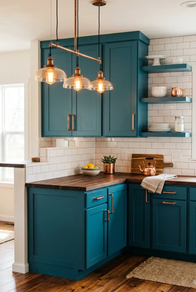
Teal and copper are a combination that just works — vibrant, warm, and genuinely unique. The blue-green of teal comes alive next to the warm reddish glow of copper fixtures. This palThis palette has a bohemian, artisanal quality that’s hard to replicate. Hacker cabinets with exposed copper-pipe hardware and pendant lights are bold yet balanced. White subway tile keeps the backsplash clean, so both teal and copper can stand out. Warm wood flooring ties the room together and adds one more layer of organic warmth.
Copper develops a beautiful patina over time, adding to the character of this palette. For a subtler version, use copper only in light fixtures and accessories while keeping cabinet hardware in matte black or bronze throughout.
21. Light Gray and Pale Blue
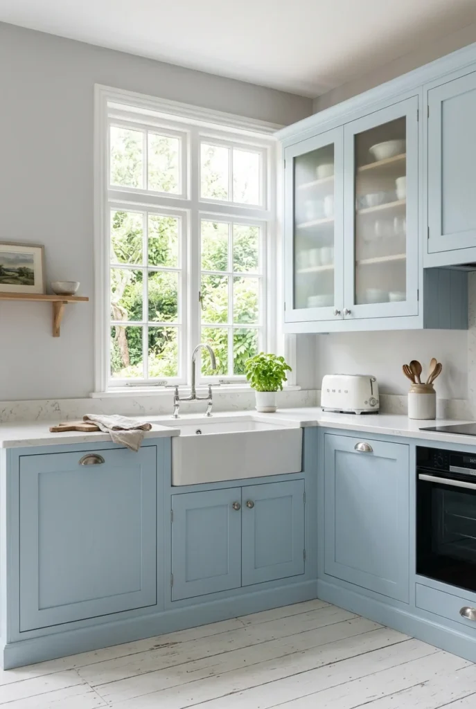
Light gray and pale blue are two of the most serene kitchen color palette ideas for those who love cool, calming tones. It brings to mind clear skies and open spaces, making even a small kitchen feel airy and genuinely expansive throughout.
Keep countertops white or very light stone to maintain the brightness of this palette. Brushed silver or chrome hardware keeps a cool-toned consistency. Frosted glass cabinet inserts add a soft, diffused quality that reinforces the overall sense of calm and serenity.
This palette works especially well in north-facing kitchens or rooms with indirect light — the cool tones make a dim kitchen feel fresher and brighter. Pair with white painted floorboards or light stone tiles to complete the clean, calming look.
22. Moody Dark Green and Black
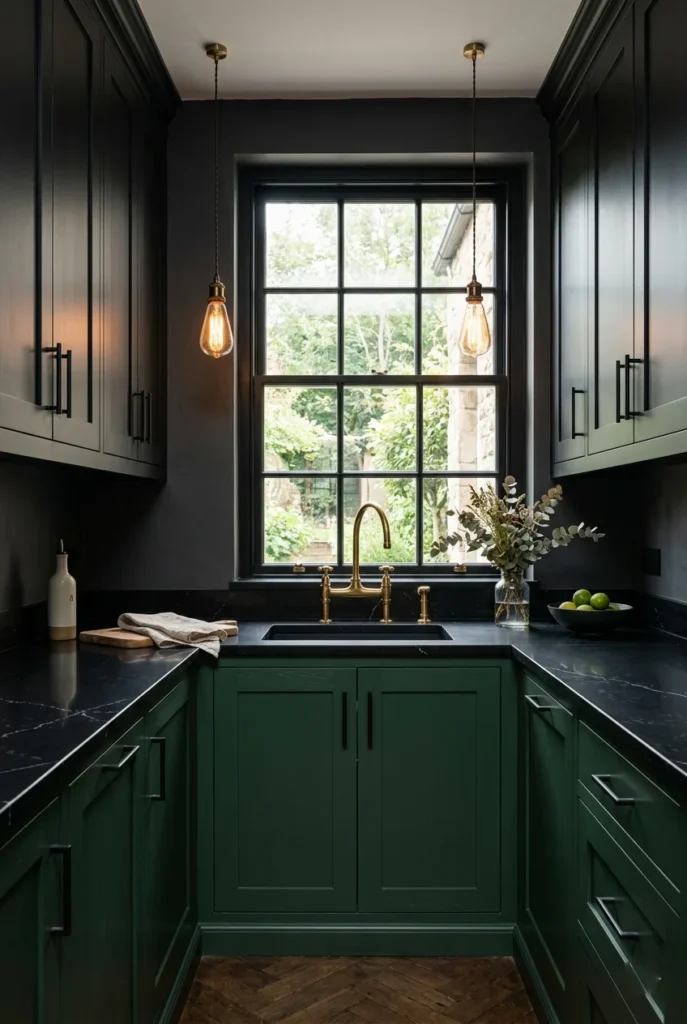
Combining deep hunter green with matte black is one of the most striking moody kitchen trends on Pinterest right now. This palette feels luxurious, dramatic, and incredibly intentional. It’s not for everyone — but for those it suits, it’s truly transformative.
Use deep green on the lowers and matte black on the uppers for a layered, tonal look rather than one flat dark mass. Brass or warm gold hardware provides just enough contrast to keep the palette from feeling oppressively heavy. Warm lighting is absolutely essential here.
Plants thrive visually against this backdrop — even simple greenery looks lush and vivid against all that dark richness. A large fiddle leaf fig or trailing pothos on open shelving adds the perfect natural contrast to this gorgeous, dramatic palette.
23. Crisp White and Concrete
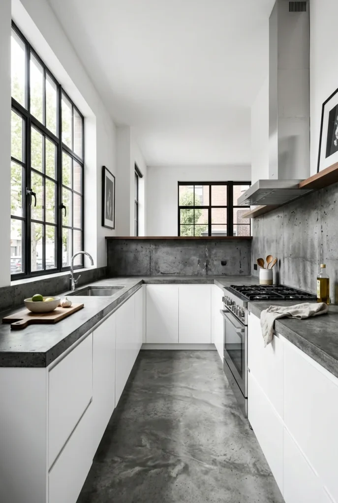
White and concrete kitchens bring a minimalist, architectural quality that’s very popular in modern and industrial-style homes. The texture of raw concrete against crisp white creates a contrast that feels bold and considered. The materials do all the talking here.
Concrete countertops and backsplash tiles are more accessible than ever — many manufacturers offer convincing concrete-effect porcelain options that are far easier to maintain. Pair with flat-front white cabinets and minimal hardware for a cohesive industrial-minimalist result.
The key to keeping this palette warm rather than clinical is organic elements — a wooden chopping board, a trailing plant on a shelf, a woven basket. These small touches bring the human element back into a very clean, architectural space.
24. Sunshine Yellow and Gray
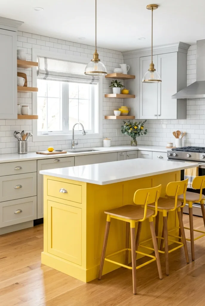
A sunshiA sunshine-yellow island against light-gray surrounding cabinets is one of the most popular and highly-pinned two-tone kitchen ideas. The gray grounds the yellow, stopping it from feeling too playful. Together, they create a kitchen that feels modern, fresh, and genuinely fun.
White countertops and subway tile keep the backdrop clean. The gray serves as the perfect neutral, letting the yellow breathe and shine without competing with anything else in the space. It’s a pairing that simply works every single time.
Yellow also gives you flexibility with accessories. Lean into it with yellow bar stools and light fixtures, or pull back and let the island be the sole pop of color. Either approach works beautifully with this clean, cheerful palette.
25. All-White Minimalist Kitchen
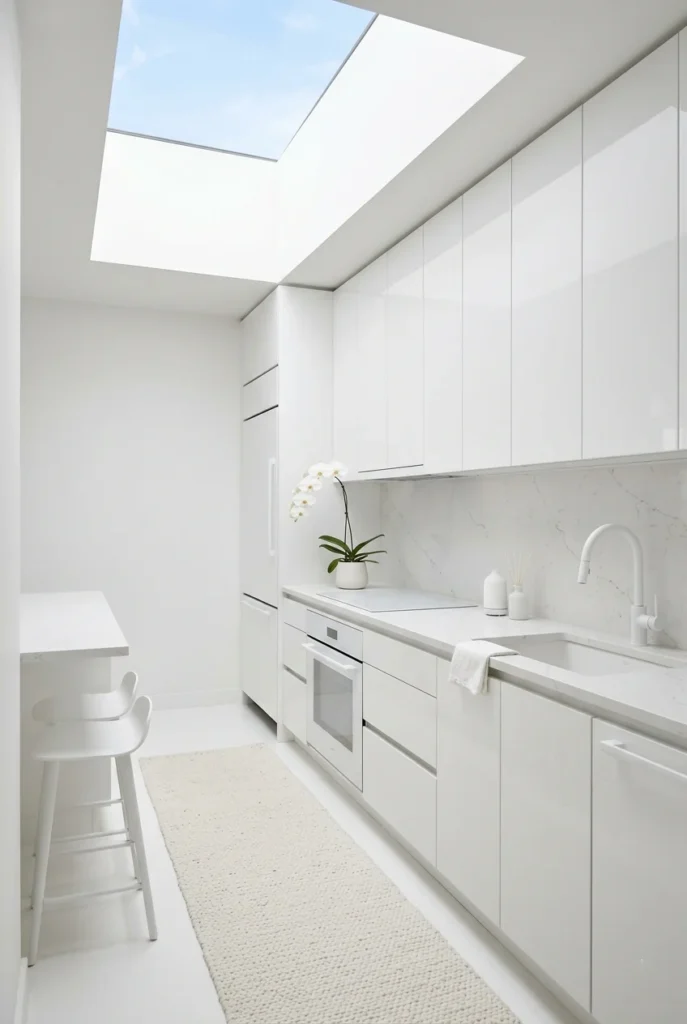
An all-white kitchen is still one of the most searched and saved kitchen color palette ideas online. When done well, it feels serene, spacious, and effortlessly elegant. The challenge — and the beauty — is creating enough texture variation so the space doesn’t fall flat.
Mix glossy white cabinet doors with a matte white backsplash tile, a honed marble countertop, and a painted white ceiling. Different finishes within the same color create a rich, layered result that doesn’t need multiple colors to stay visually interesting.
Everything displayed in a white kitchen looks spectacular — copper pots, green herbs, colorful ceramics. It’s the ultimate blank canvas. Just know it rewards regular upkeep, and the payoff is a kitchen that always feels clean, bright, and wide open.
26. Terracotta and Forest Green
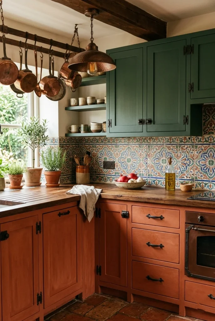
Terracotta and forest green together create one of the richest, most vibrant kitchen color combinations inspired by nature. These are the colors of clay, earth, and dense foliage — together they bring a deeply organic, bohemian warmth that few other palettes can match.
Use terracotta on lower cabinets and forest green on uppers for a daring two-tone approach that still feels balanced. A Moroccan-inspired tile backsplash in warm earthy tones bridges both colors beautifully. Natural wood countertops and iron hardware complete the organic, handmade feel.
This palette gets better with accessories — copper pots, handmade ceramics, woven textiles, and abundant plant life all look spectacular against terracotta and green. It’s especially popular in eclectic and globally inspired interiors.
27. Pale Lavender and White
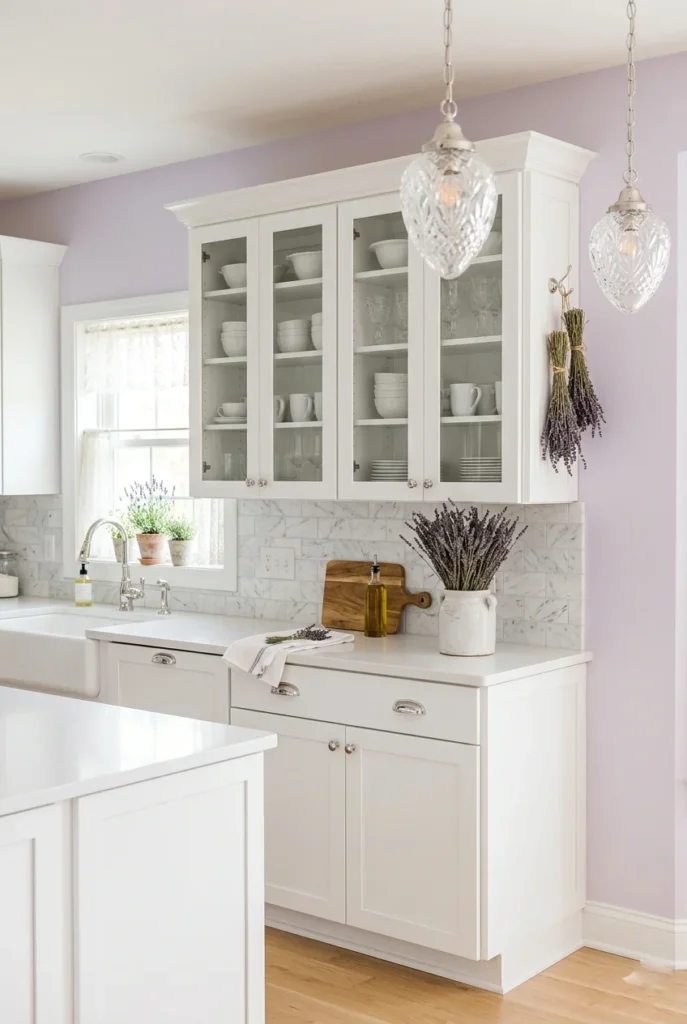
Pale lavender is an unexpected but enchanting choice for a kitchen. At its most muted, it reads almost like a warm white with a gentle purple undertone — soft, calming, and surprisingly sophisticated. Paired with white cabinetry, the result is genuinely dreamy.
Use a very muted, dusty lavender rather than bright purple — think the color of lavender fields at dawn. White cabinetry and silver hardware create a delicate look that’s soft and feminine without being overwhelming or too themed.
Dried lavender bunches hung from ceiling hooks, silver cutlery, and white ceramic dishware all feel perfectly at home here. It’s a kitchen color palette that not many people try, which is exactly why it stands out so powerfully on Pinterest boards.
28. Warm Walnut and Off-White
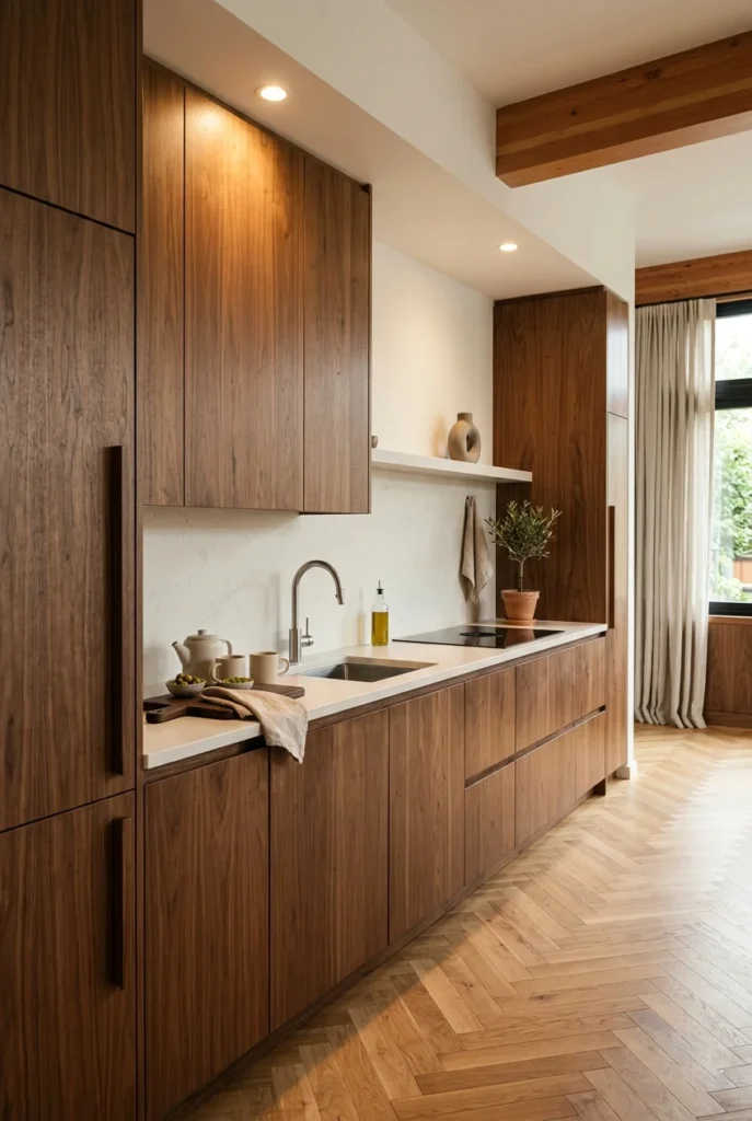
Full walnut wood kitchens feel expensive, organic, and deeply warm. The rich grain and warm brown tones are enough on their own to create a stunning palette — off-white countertops and walls provide just the right contrast and light. This is understated luxury done right.
Integrated appliances with wood-panel fronts matching the cabinetry give this kitchen a seamless, custom feel. Warm recessed lighting brings out the honey and amber tones in the walnut grain. A herringbone parquet floor in the same walnut family ties the whole space together.
This palette works especially well in open-plan living spaces where the kitchen should blend harmoniously with adjacent rooms. The warm tones of walnut create a cohesive flow from the kitchen to the dining area to the living area without any jarring transitions.
29. Slate Blue and Warm Brass
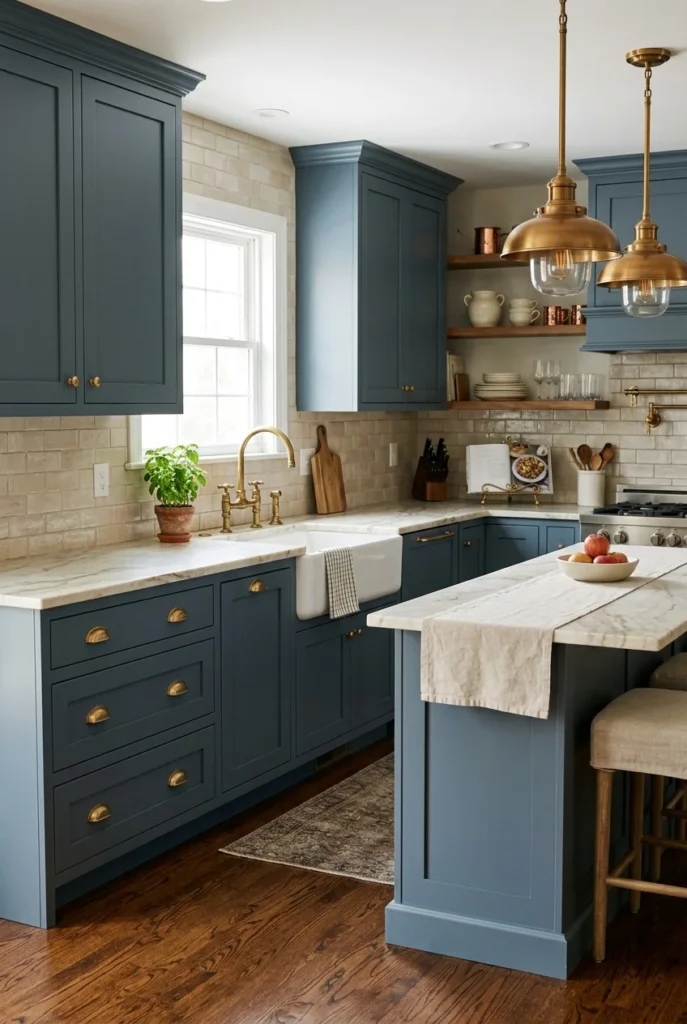
Slate blue sits beautifully between navy and gray — deeper than both, with a sophistication that’s hard to match. Paired with warm brass fixtures and hardware, it creates a kitchen palette that feels both timeless and genuinely current. Refined and understated.
Unlacquered brass hardware — the kind that develops a natural patina over time — gives this kitchen a truly bespoke quality. Cream marble countertops and a soft beige backsplash keep the palette from feeling dark or heavy. Warm brass pendants over the island complete the picture perfectly.
This combination photographs beautifully in warm late-afternoon light, when the brass glows, and the slate blue deepens into something almost magical. If you want a kitchen palette that looks just as good in ten years, this is one of the most timeless choices available.
30. Colorful Maximalist Mix
Not every kitchen has to be neutral or restrained — and the maximalist kitchen trend on Pinterest proves that more can absolutely be more. A colorful, eclectic mix of tiles, cabinet colors, and collected objects creates a kitchen full of joy and personality that no neutral palette can match.
The key to maximalism that works is finding a unifying thread — a shared color family, a consistent material, or a coherent cultural reference. Hand-painted tiles with a Mediterranean or Moroccan flavor can tie together multiple cabinet colors and eclectic accessories, creating a look that feels curated rather than chaotic.
This is the kind of kitchen people walk into and immediately want to know the story behind every single object. It celebrates the owner’s life, travels, and tastes. And it’s a reminder that your kitchen doesn’t need to look like a showroom — it just needs